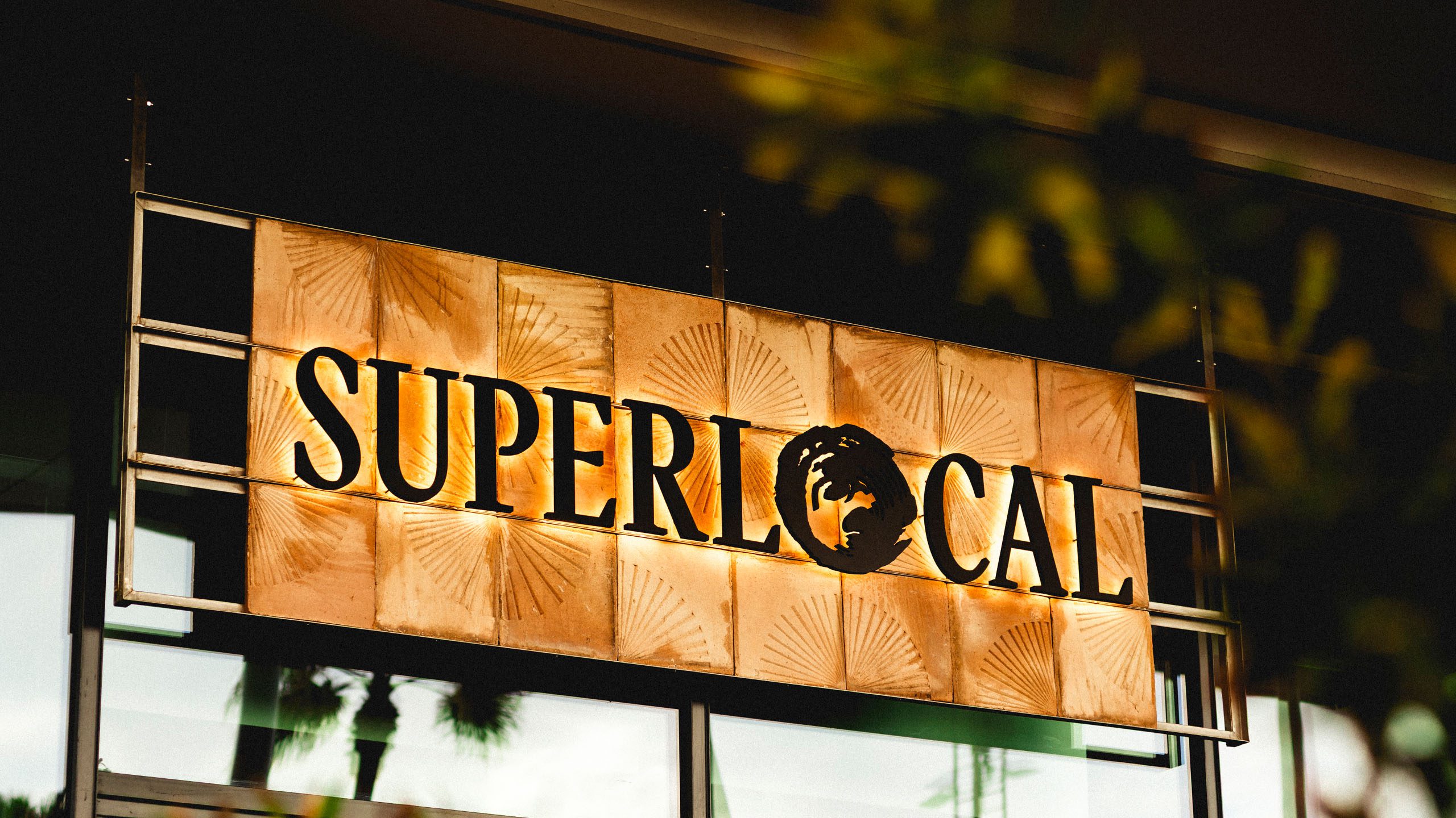
Superlocal
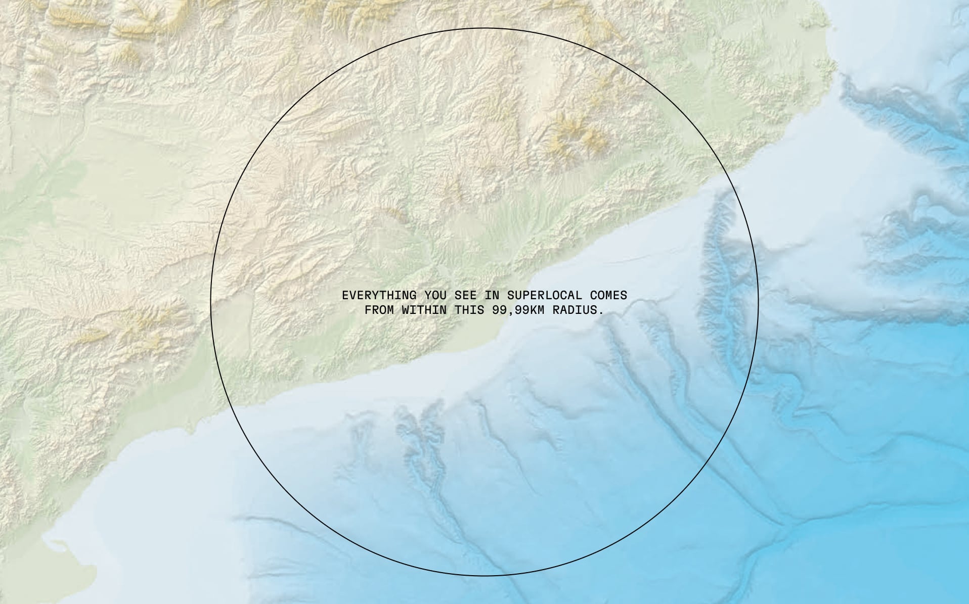
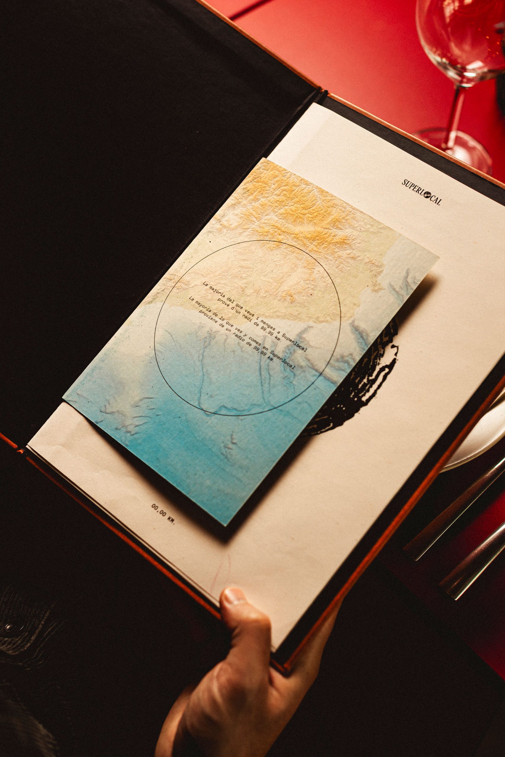
A restaurant where local is taken to the extreme. Everything, from the interior design to the food, comes from within a 99.99km radius.
Hospitality
Branding / Illustration / Print
The story behind Superlocal
Eating local is nothing new in hospitality, but Superlocal takes the idea to a whole new level. It’s a celebration of everything that can be found close to home. Proof that you don’t have to look far to find quality produce, design, and materials.
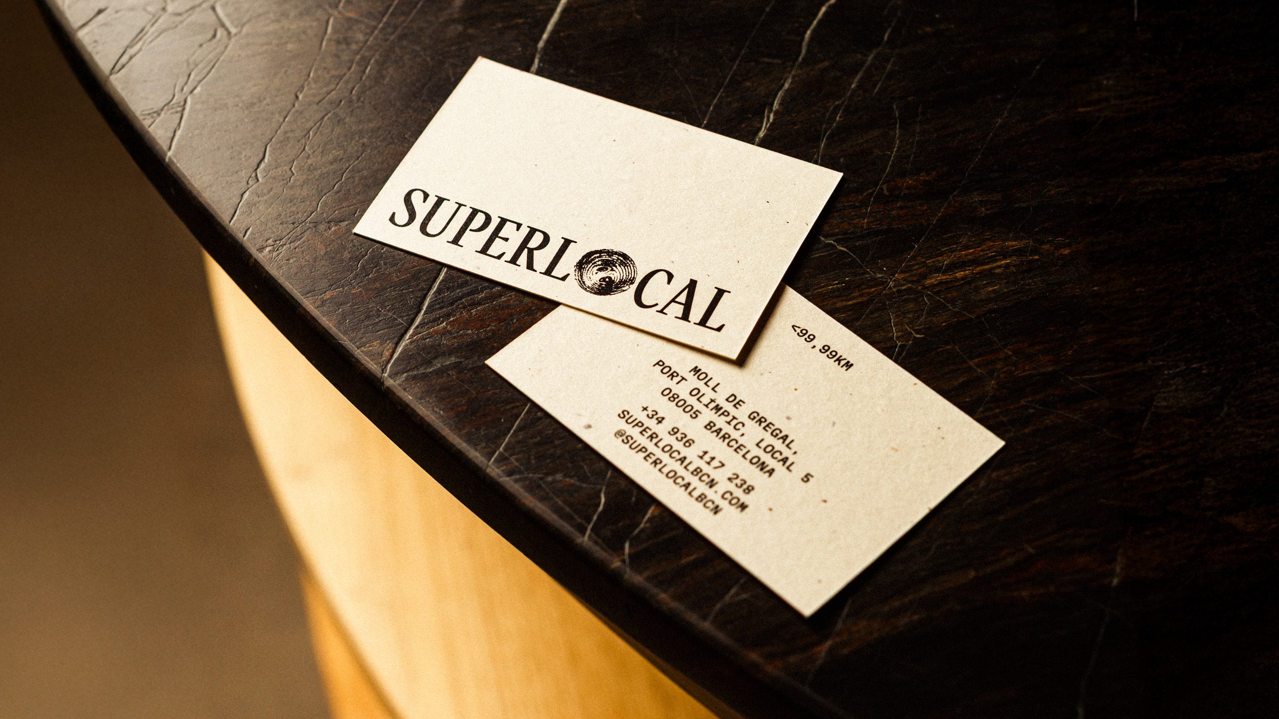
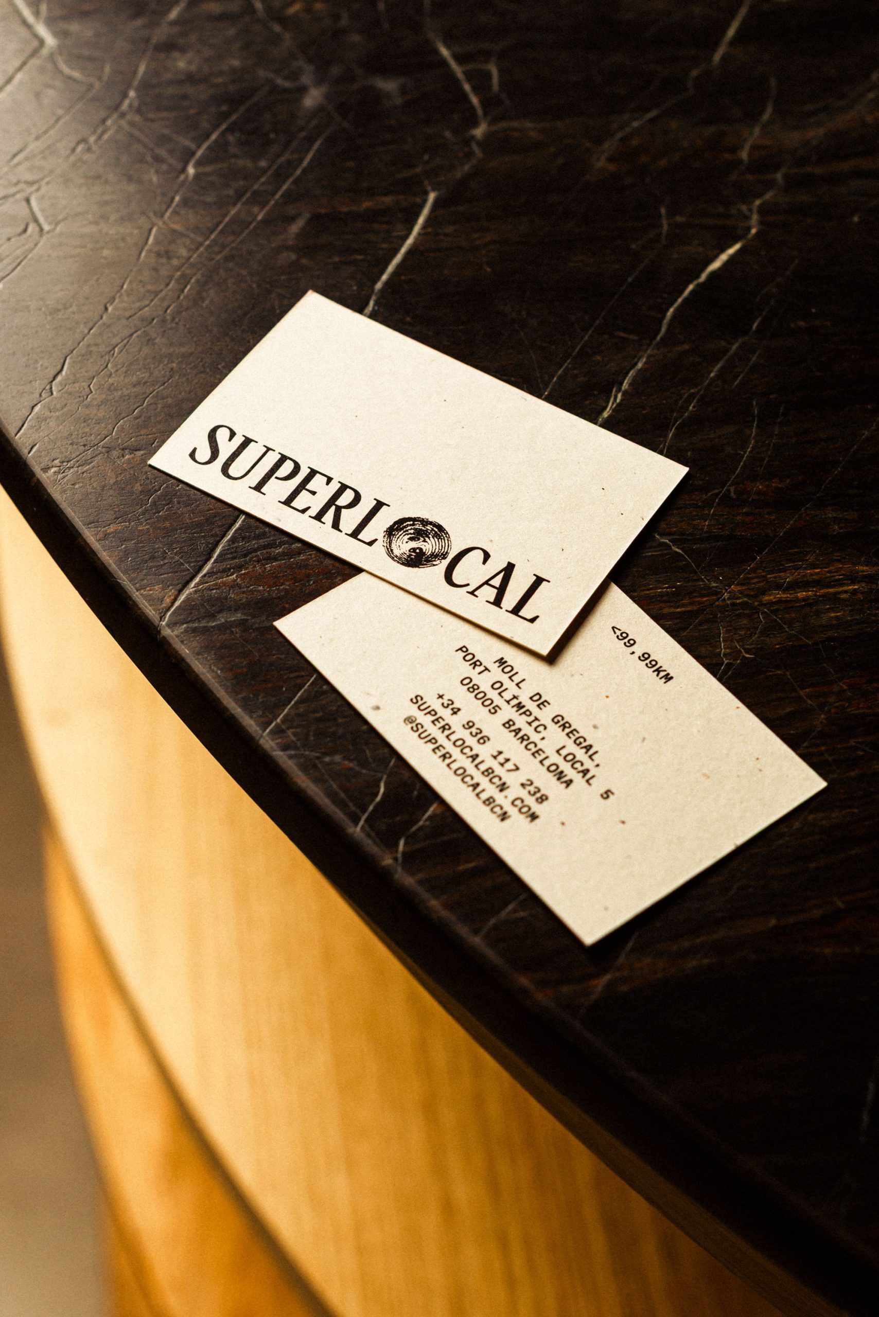
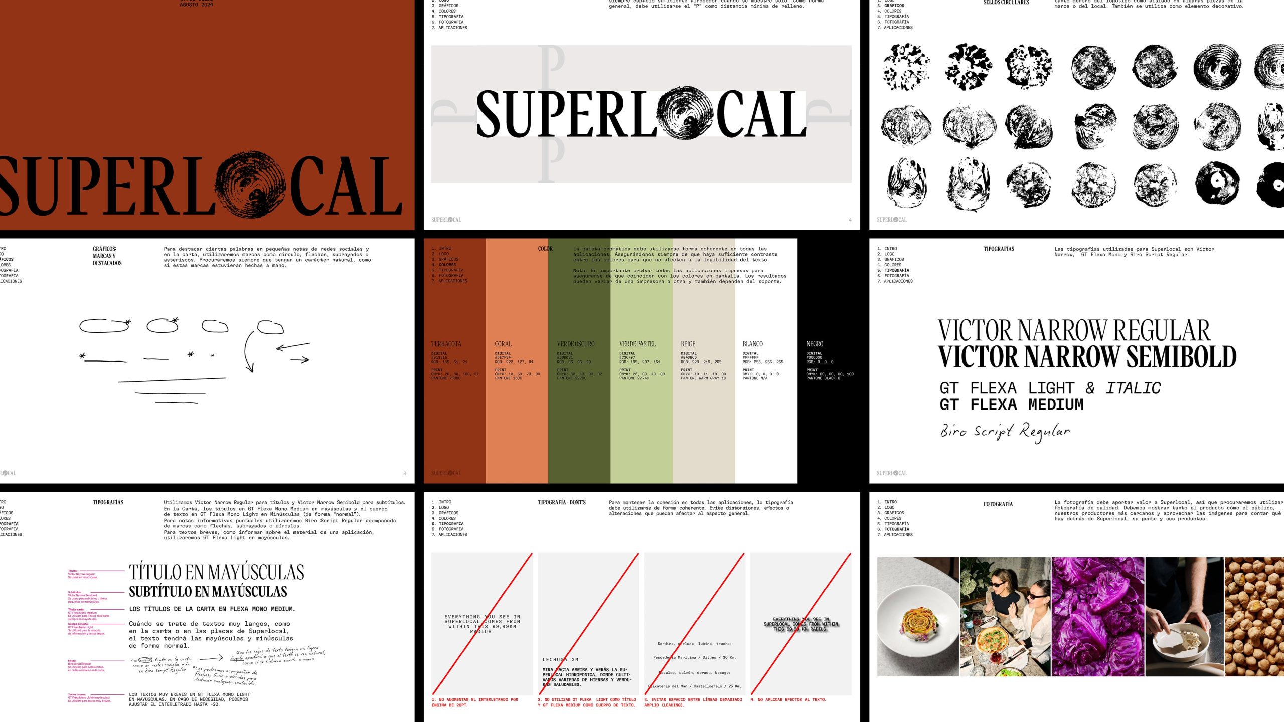
From the food to the interiors, everything is sourced within a 99.99 km radius. The visual identity reflects this super local philosophy by placing local produce at its centre. We created stamps of fruits and vegetables sourced from the area, using them to replace the “O” in Superlocal. A playful metaphor for the radius itself.
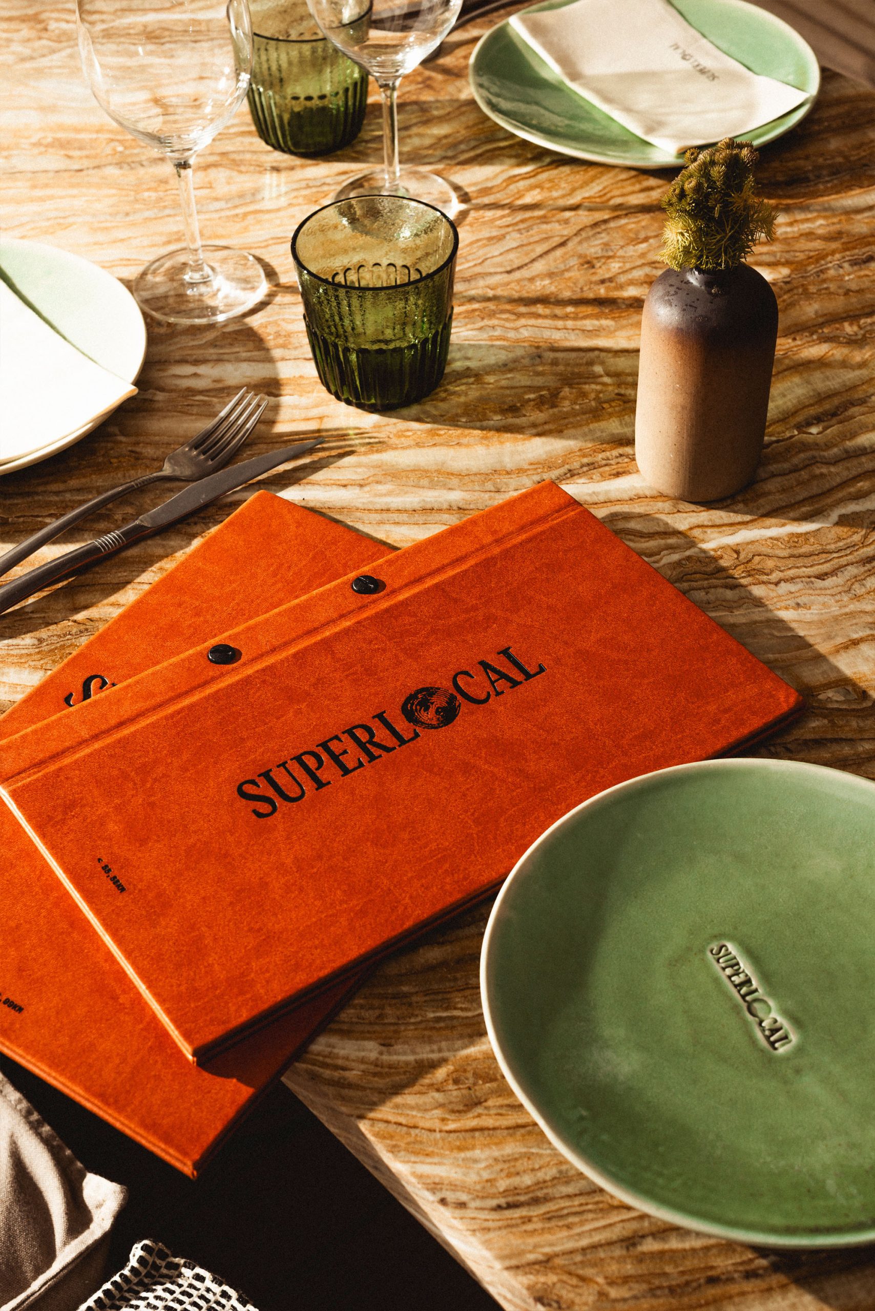
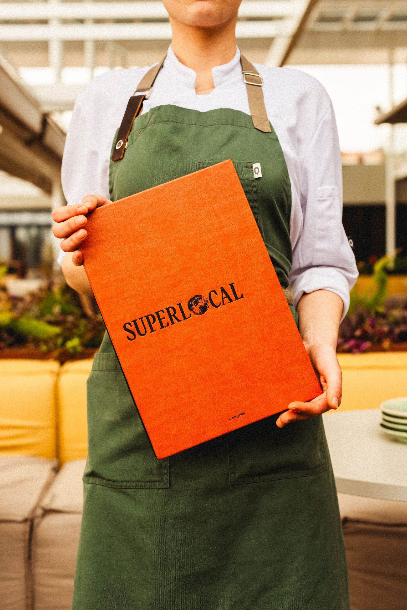
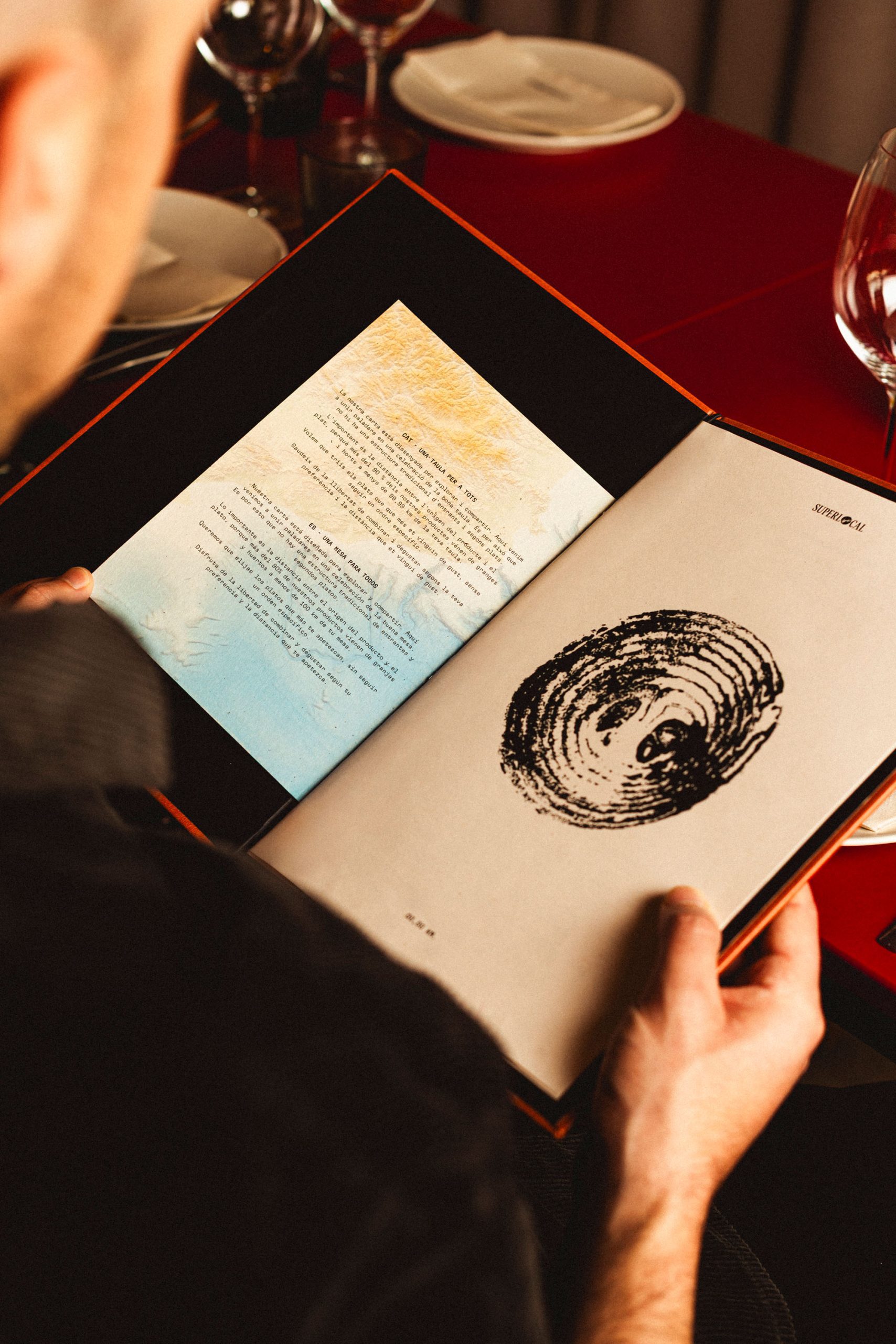
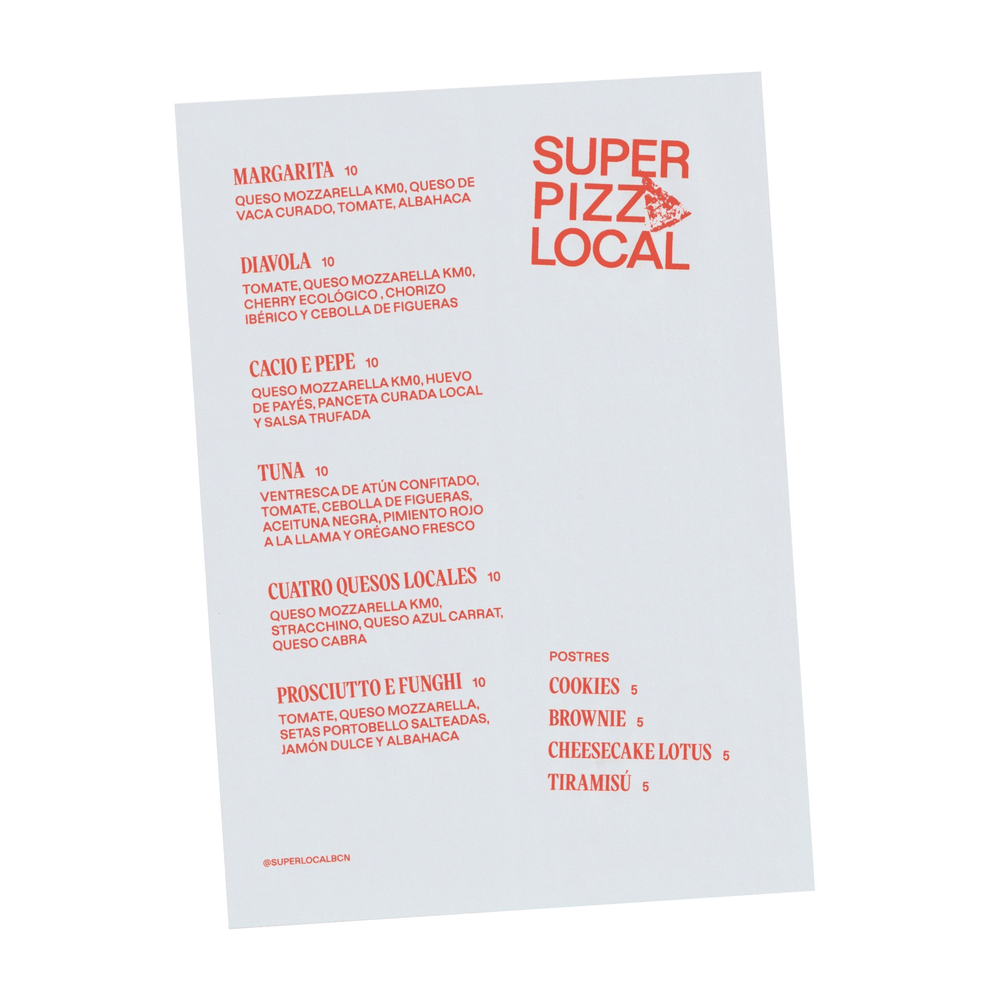
As in any restaurant, the menu is a key moment for storytelling. At Superlocal, it takes centre stage. A map illustrating the 99.99 km sourcing radius is prominently featured, anchoring the concept in a real location.
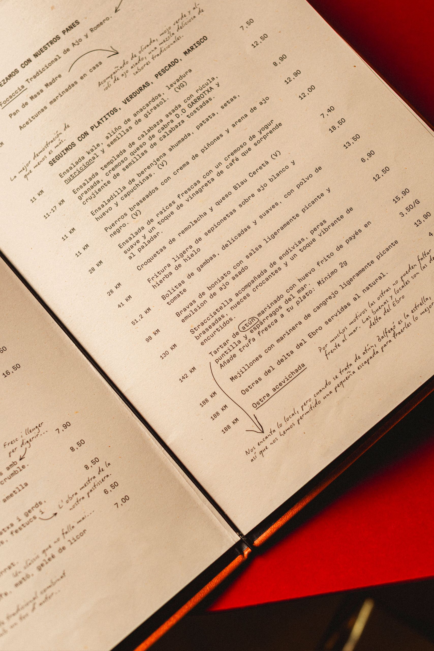
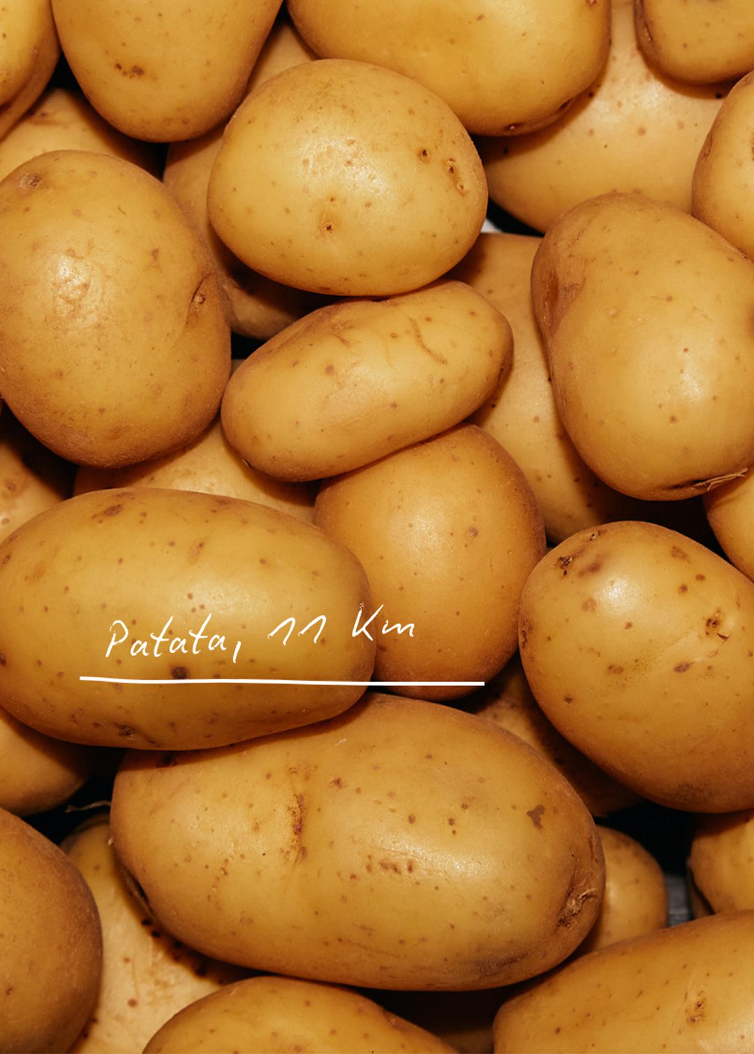
Handwritten notes are scattered throughout, drawing attention to standout ingredients and the local producers behind them.
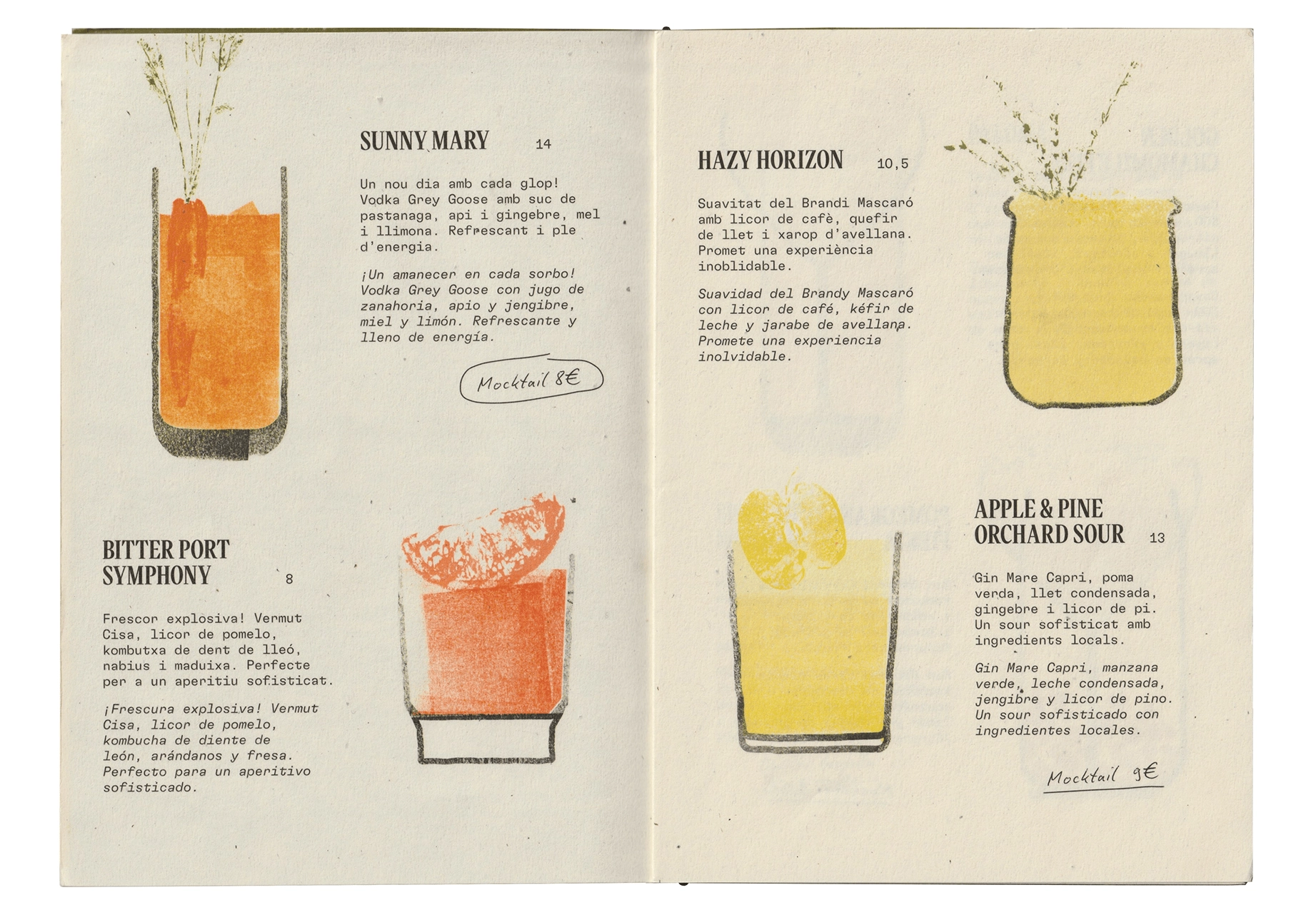
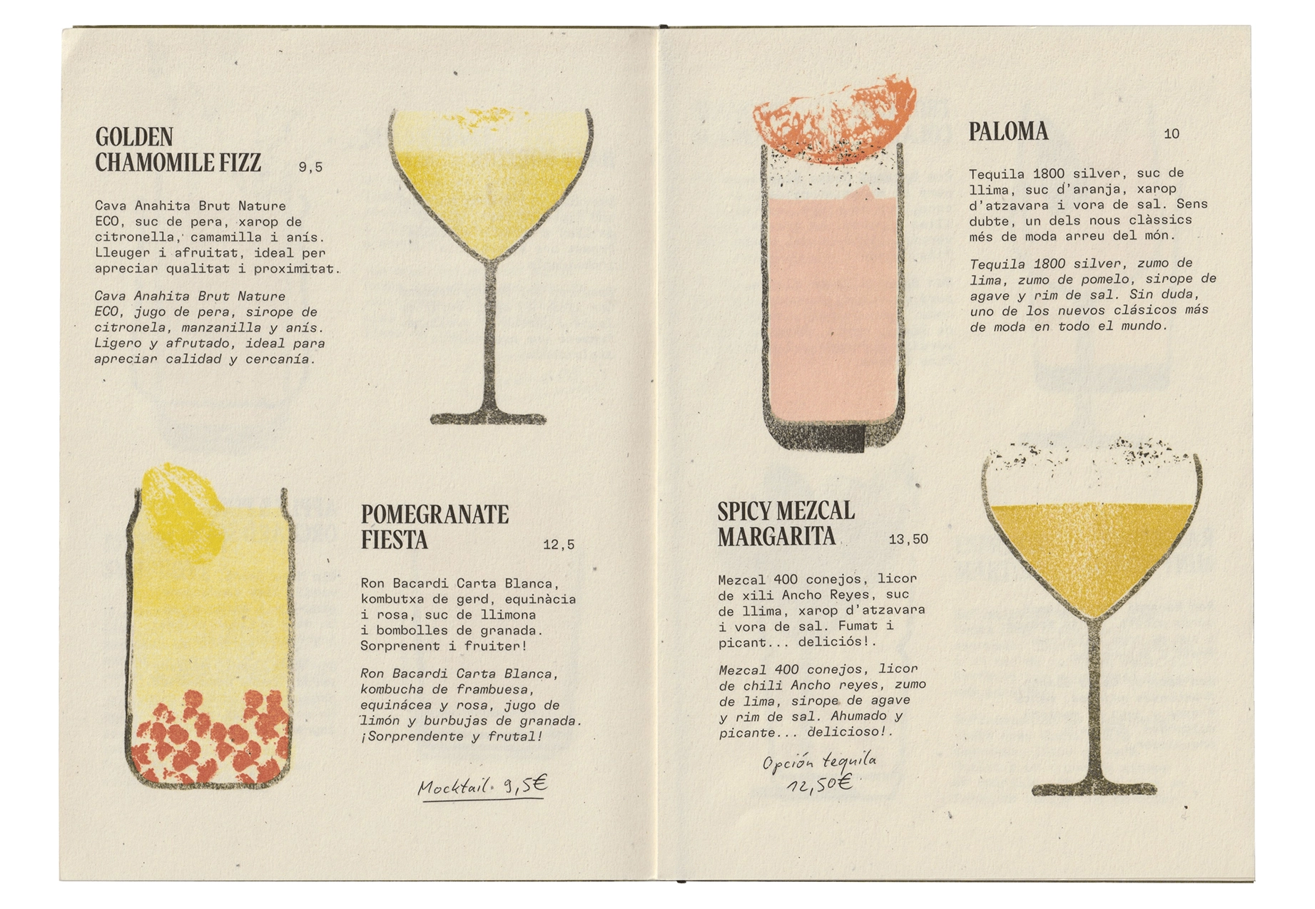
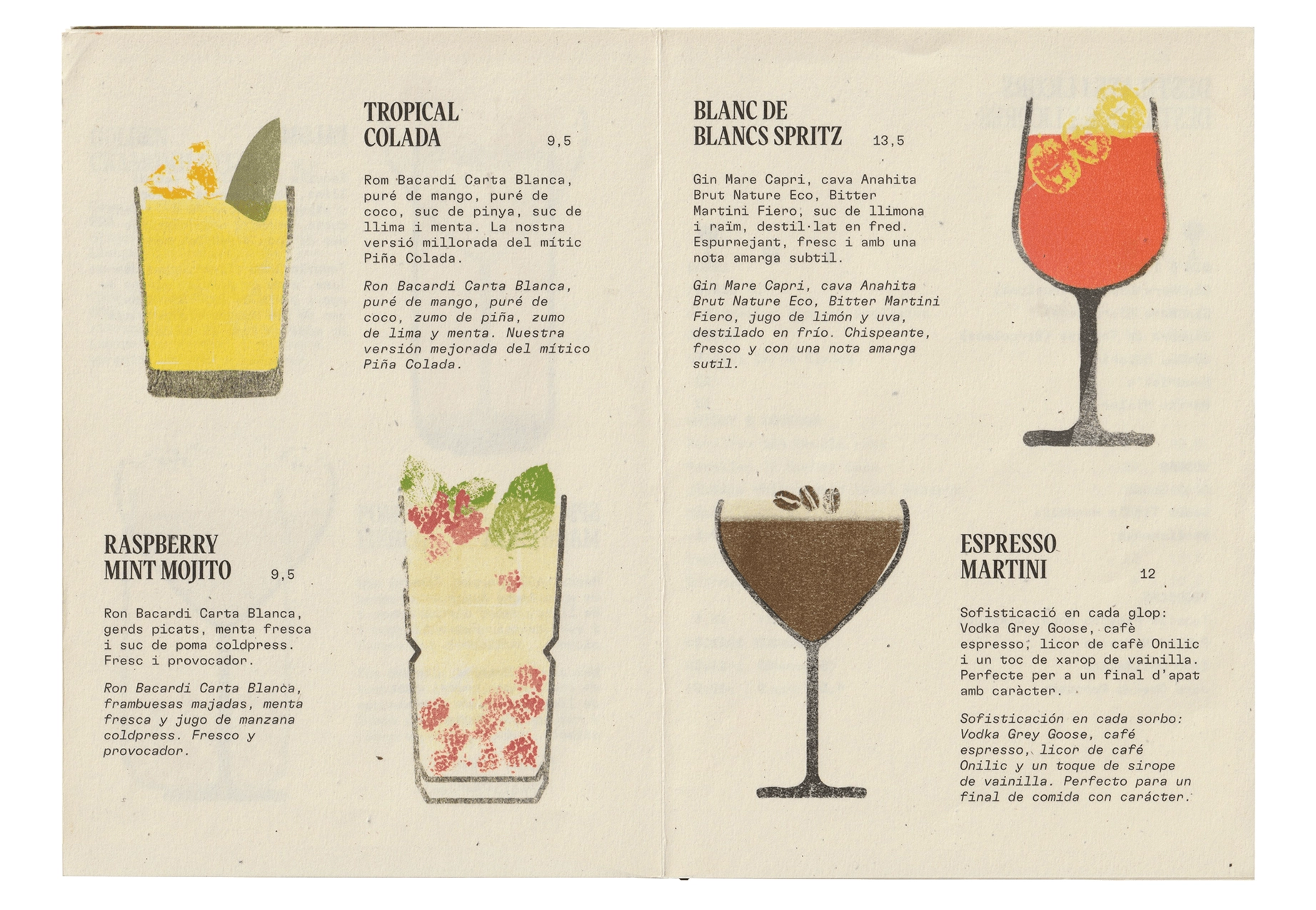
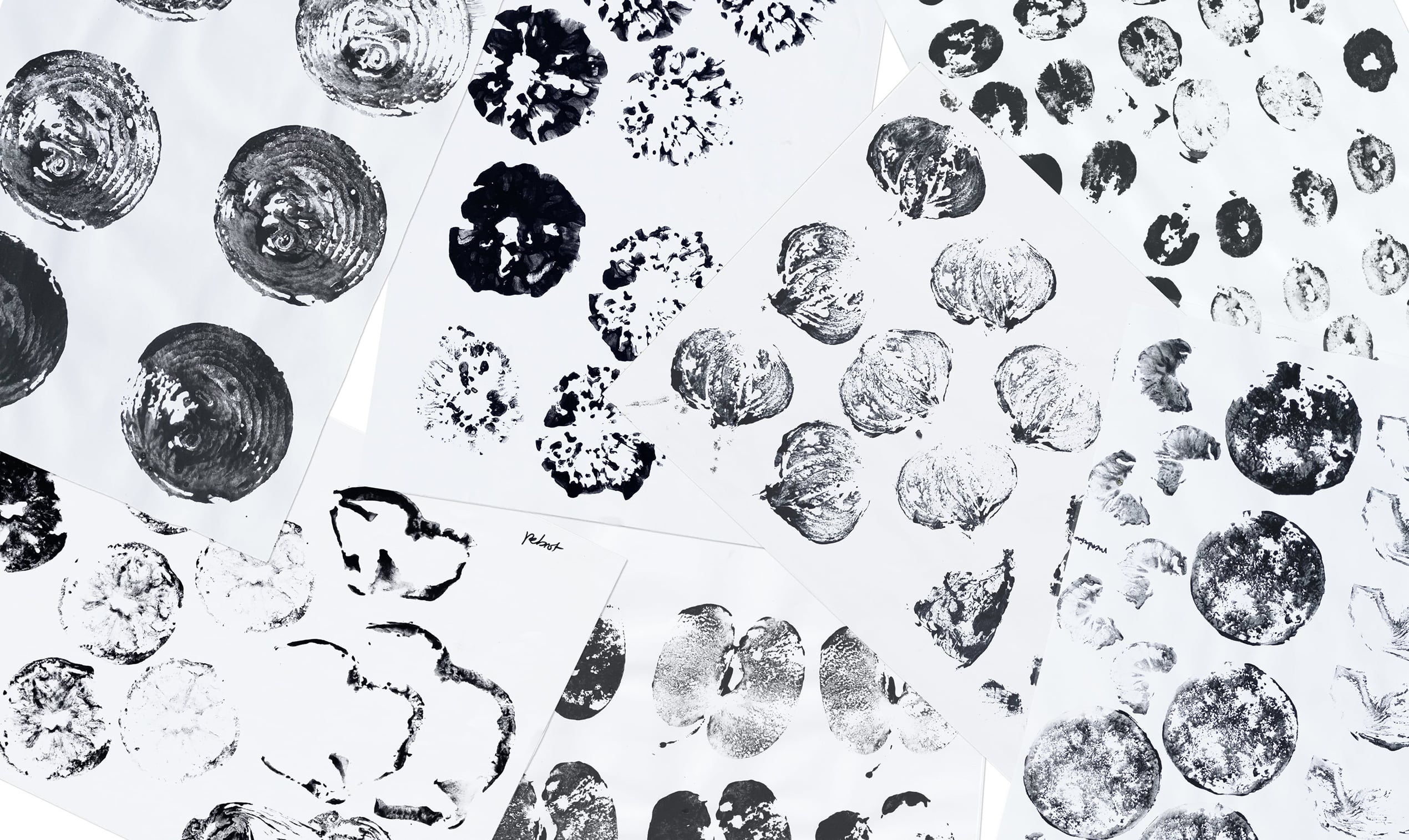
The cocktail menu features custom illustrations created with real ink stamps for each drink’s main ingredients. This approach echoes the design of the logo and reinforces the use of fresh, local produce in every cocktail.
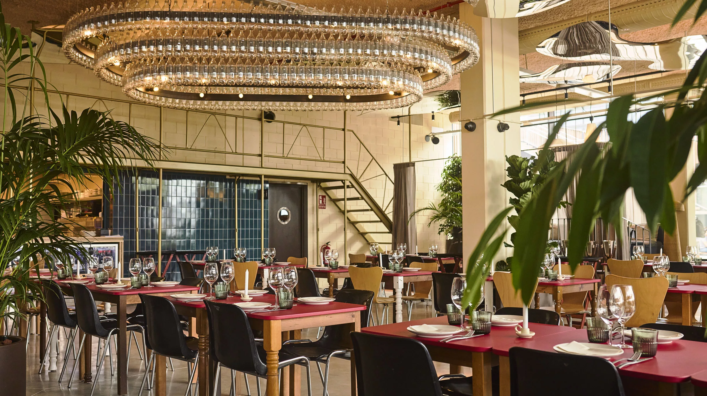
The interior design, by Studio Antonius, is built entirely around upcycled materials. Table legs rescued from antique markets, discarded tiles given a second life, and a striking chandelier made from hundreds of recycled plastic bottles all come together to create a space with character.
Even in the smallest applications, like napkins, there’s an effort to tell the story behind each element. The origin of the materials and the names of the local providers are proudly shared, reinforcing the idea that proximity is a value worth celebrating.


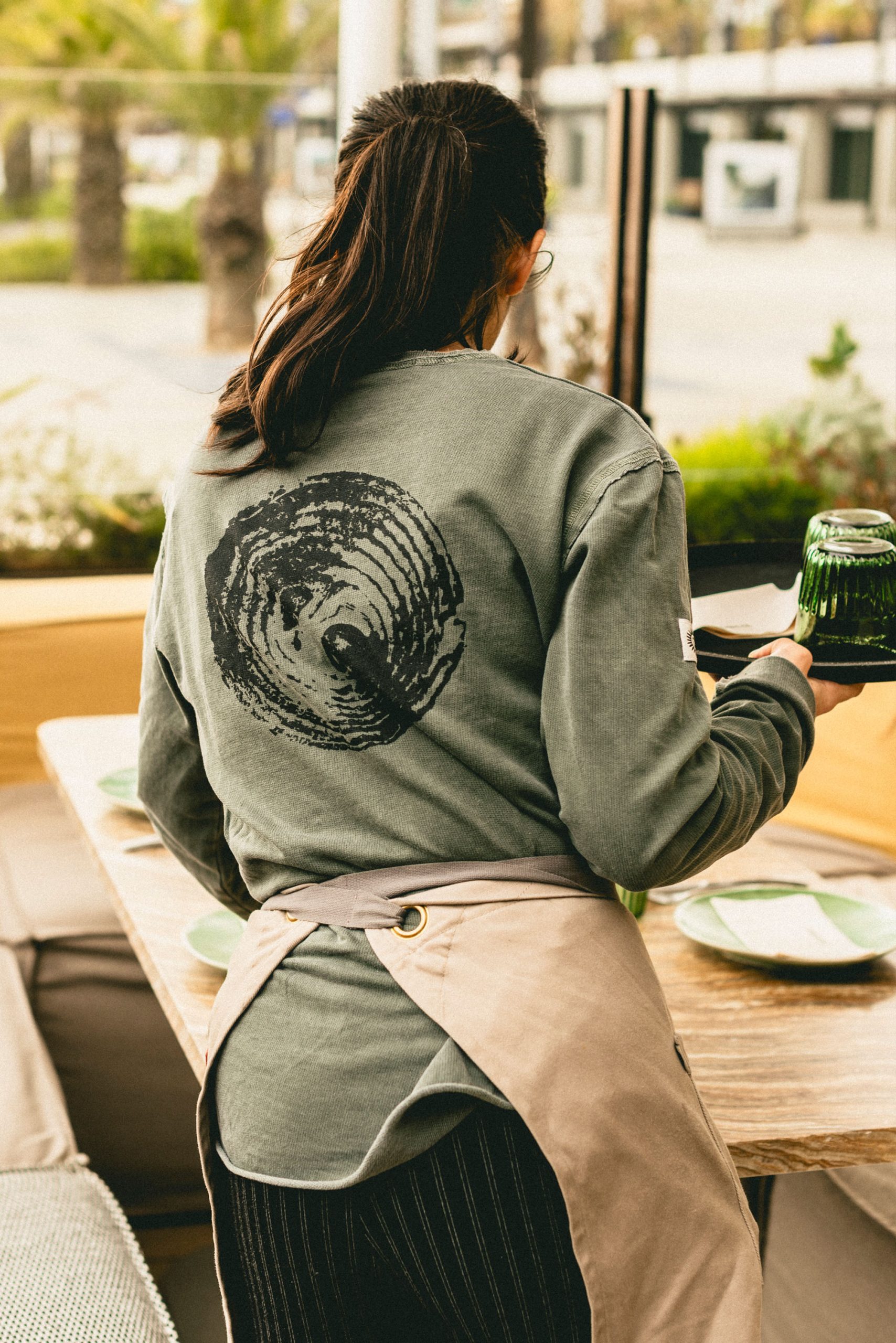
For social media, we continued to use hand-drawn notes to highlight key information such as the local ingredients used at Superlocal. This informal, human touch reinforces the brand’s commitment to local sourcing and keeps the identity grounded in its core values.
We concluded the project with a comprehensive set of brand guidelines, designed to support both internal teams and external partners in implementing and rolling out the identity consistently.
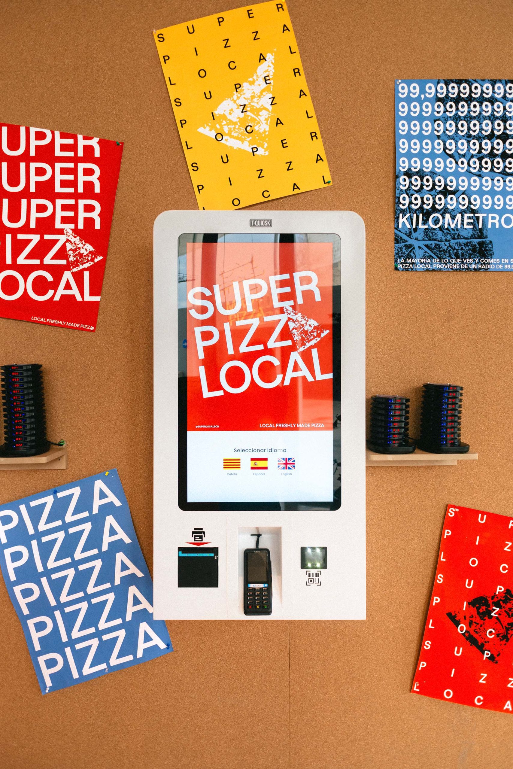
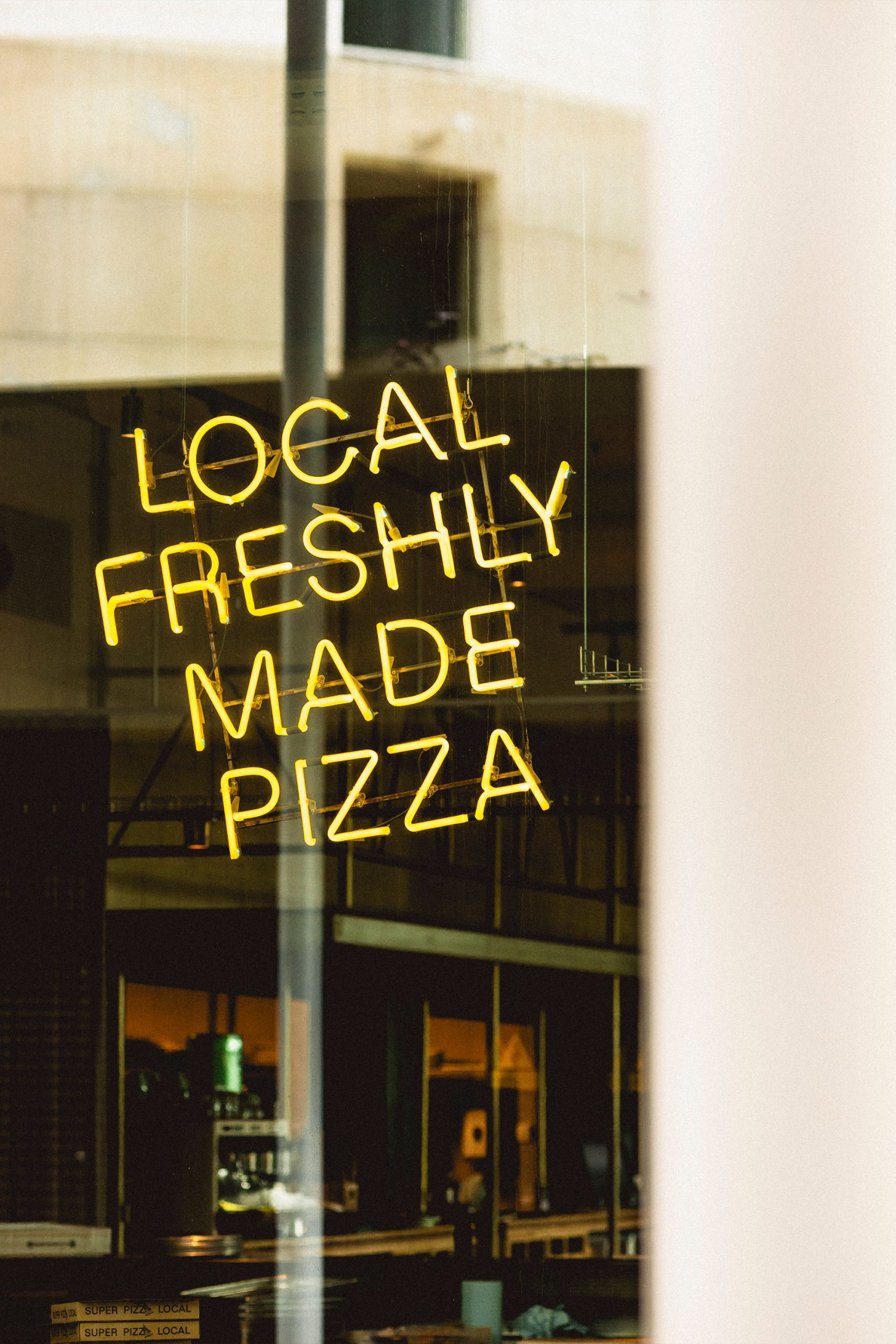
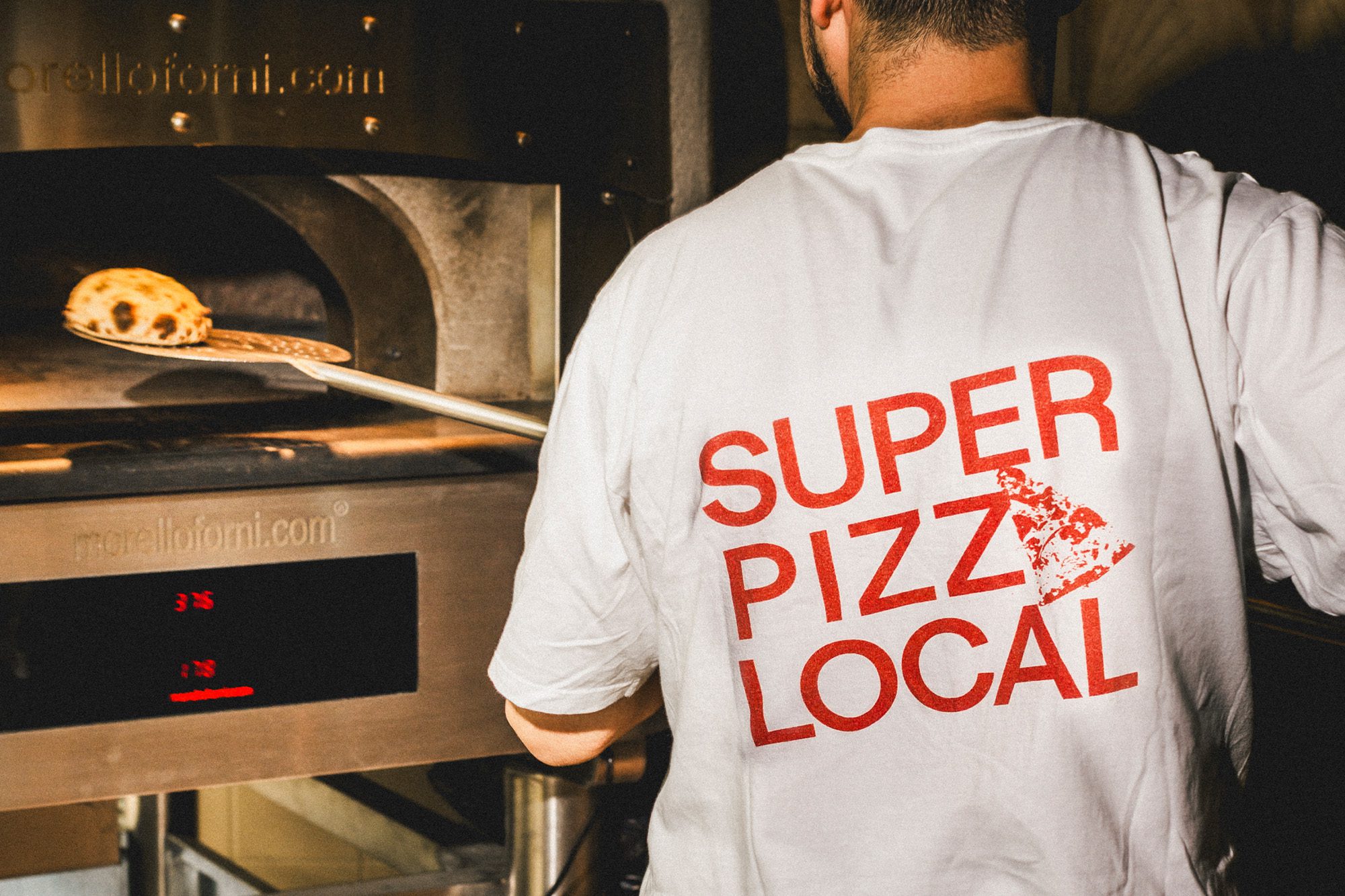
SuperPizzaLocal is Superlocal’s dedicated pizza counter, serving artisanal, stone-baked sourdough pizzas made with local ingredients
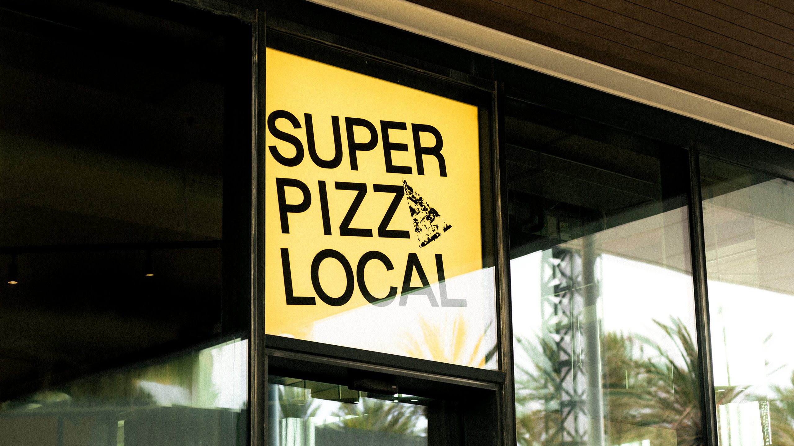
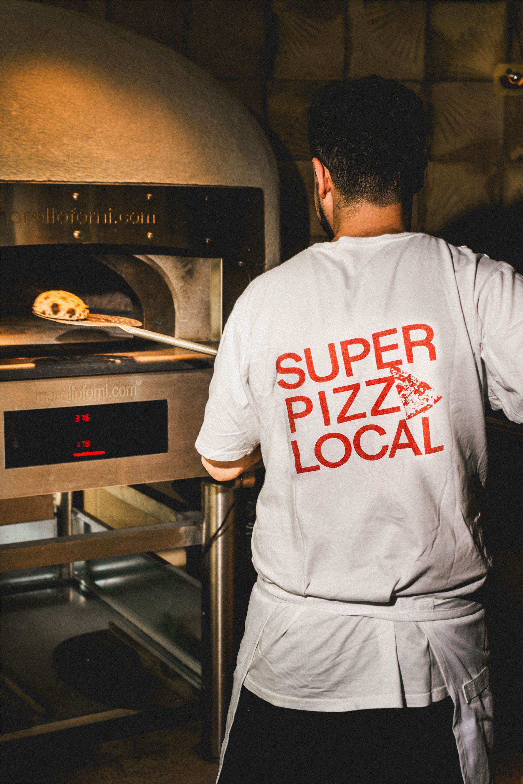
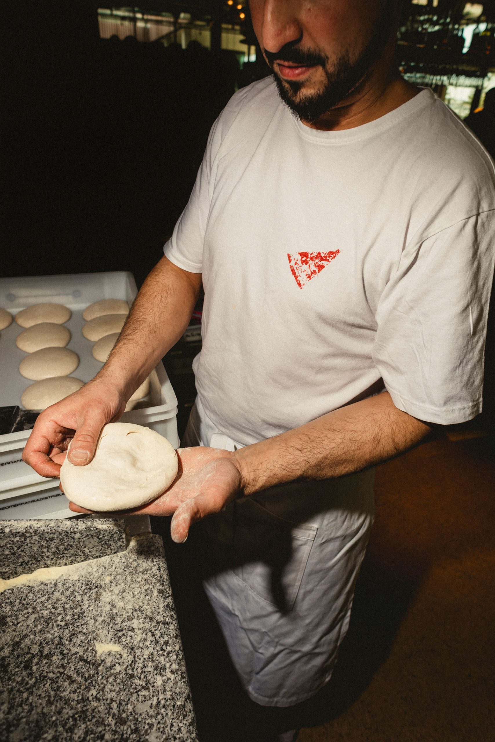
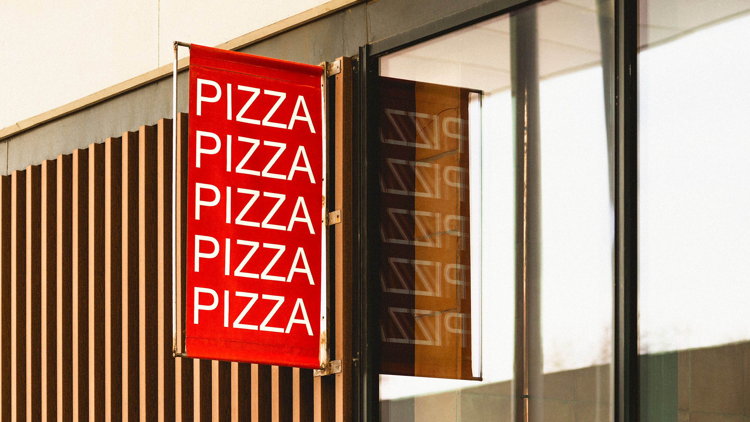
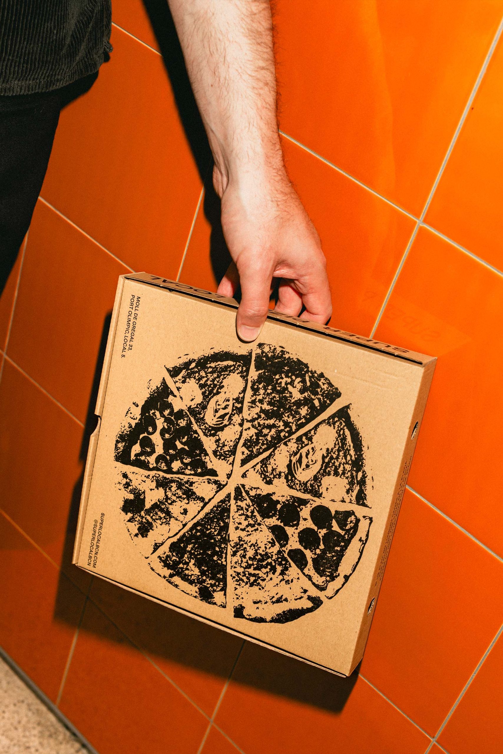
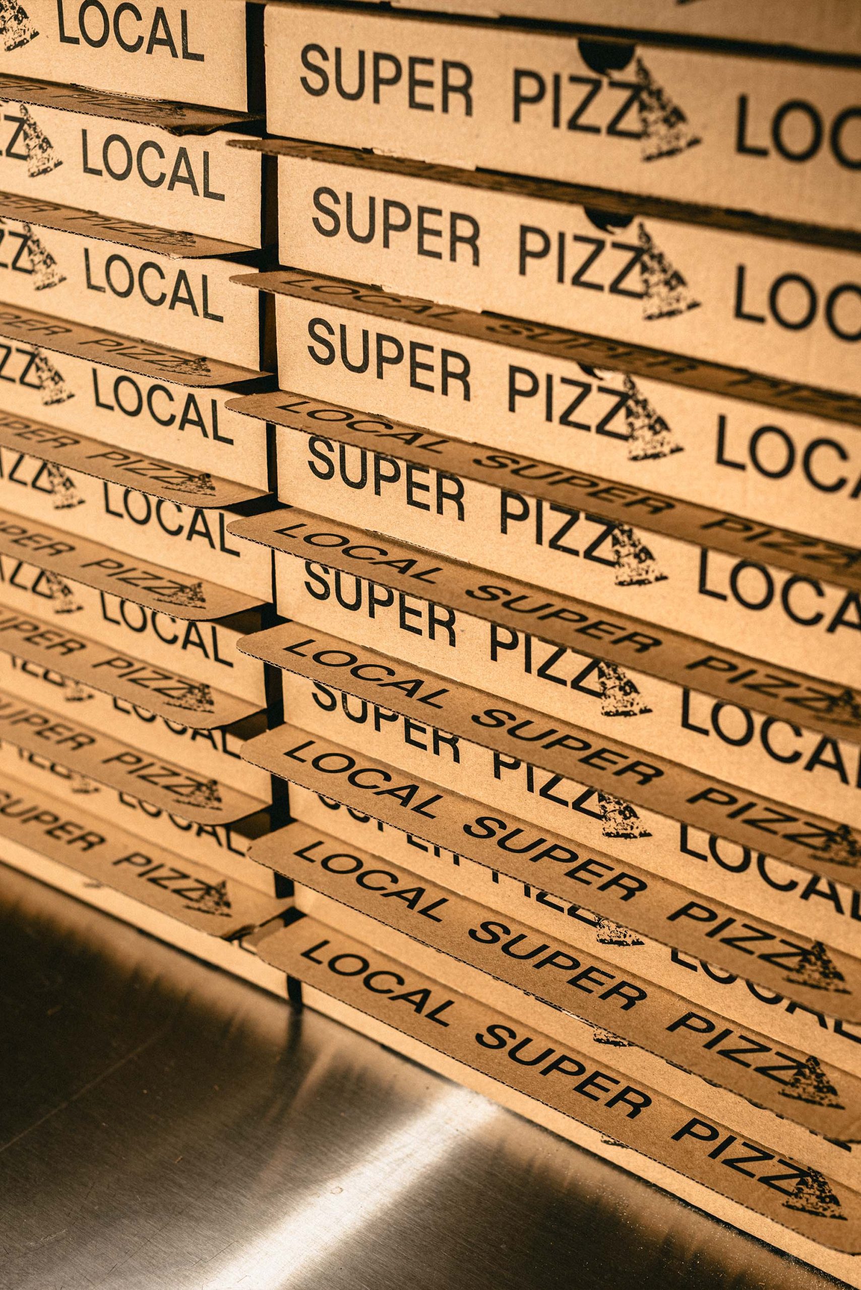
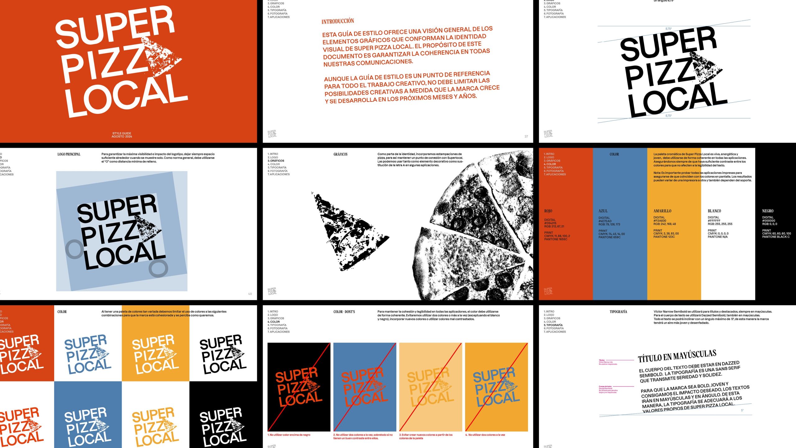
The visual identity for SuperPizzaLocal builds on the core Superlocal branding, with the ‘A’ in the logo swapped for a stamped pizza slice. A full stamped pizza features across other applications, such as the pizza boxes.
The bright, playful colour palette is designed to appeal to a younger audience looking for a quick, casual takeaway; without compromising on quality or local ingredients.
We concluded the project with a comprehensive set of brand guidelines, designed to support both internal teams and external partners in implementing and rolling out the identity consistently.
Credits
Dennis
Creative Direction: Josh Nathanson
Design & Animations: Marina Coll
Design: Ainara Martí
PM: Osvaldo Miranda
Photography: Martí Pujol
Interior Design: Studio Antonius
Social Media: Sra. Nilsson
Client: Pantea Group
Everything
RootinaA Madrid restaurant serving food that's worth repeating
AleníA night kitchen hidden in the lobby of Hotel Brummell
Hotel ReginaA Barcelona icon, reinventing itself for over a century
8 Holland Street TownhouseA unique guesthouse in the heart of historic Bath
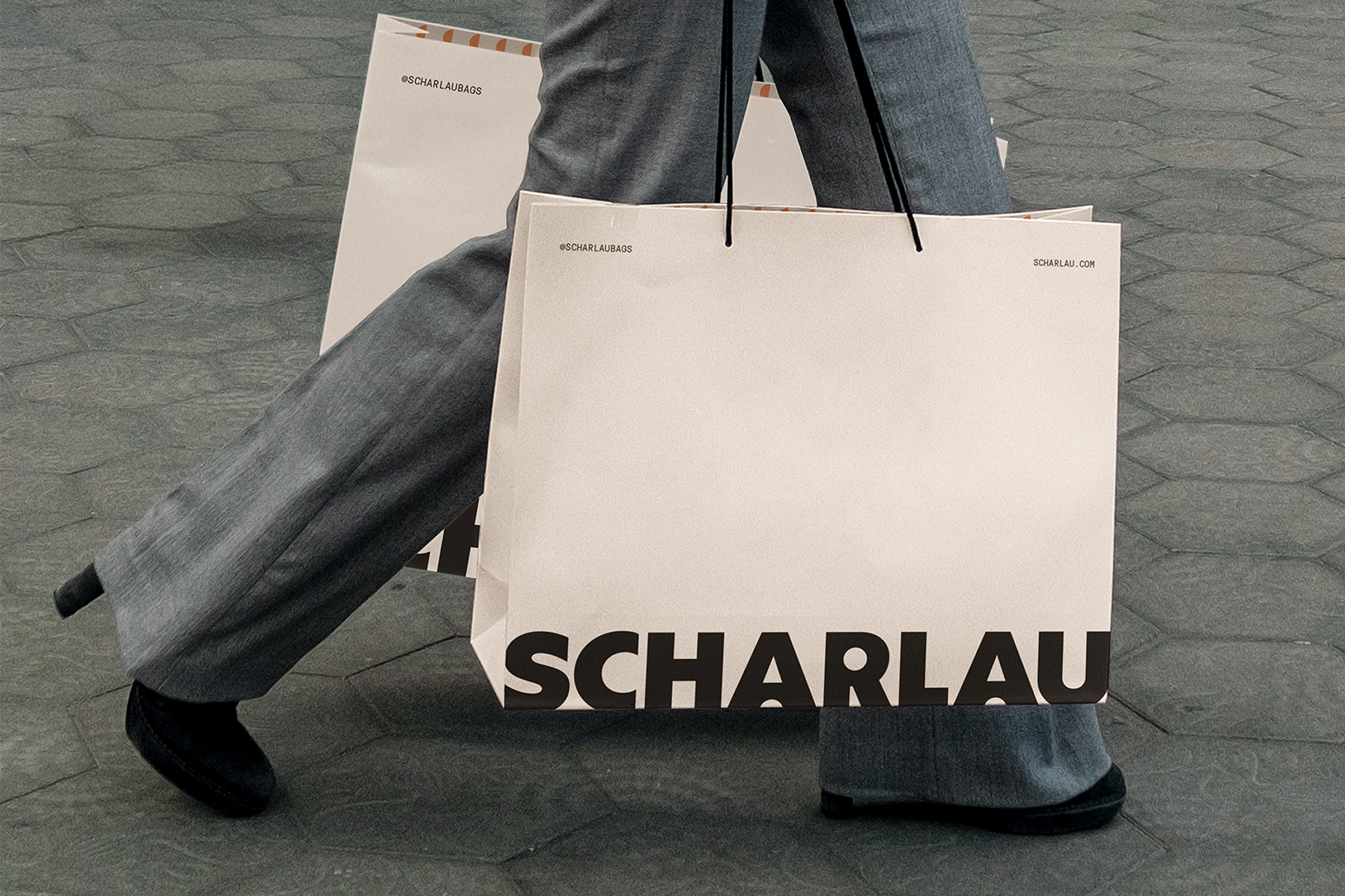
ScharlauA premium accessories brand for people always on the move
Restaurant & Bar Design Awards 2024A celebration of collaboration in the hospitality industry
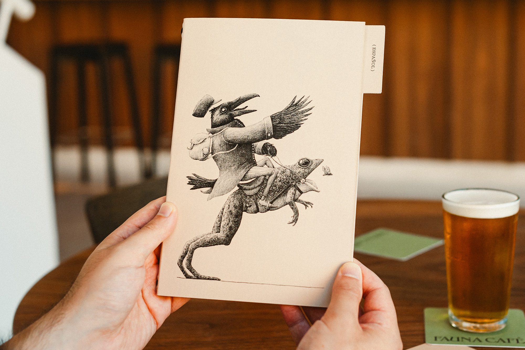
Fauna CaféA café in Barcelona crawling with curious creatures
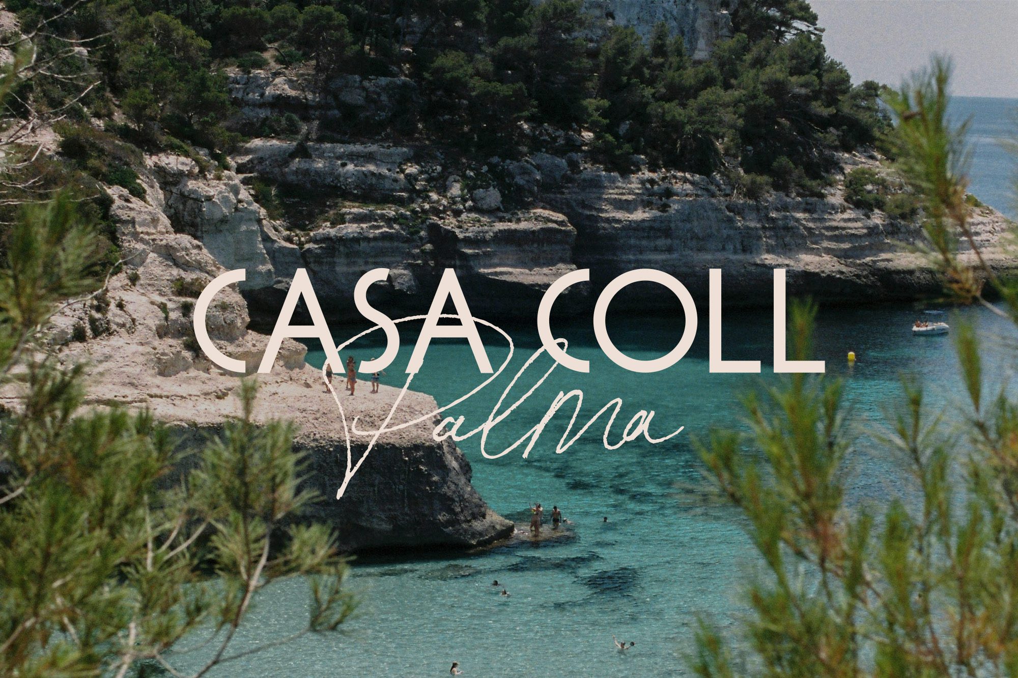
Casa Coll HotelsHotels designed for Mediterranean fun, with a conscience
Bar BaumaA Barcelona classic with more than 80 years of history
SuperPizzaLocalSourdough takeaway pizzas celebrating local ingredients
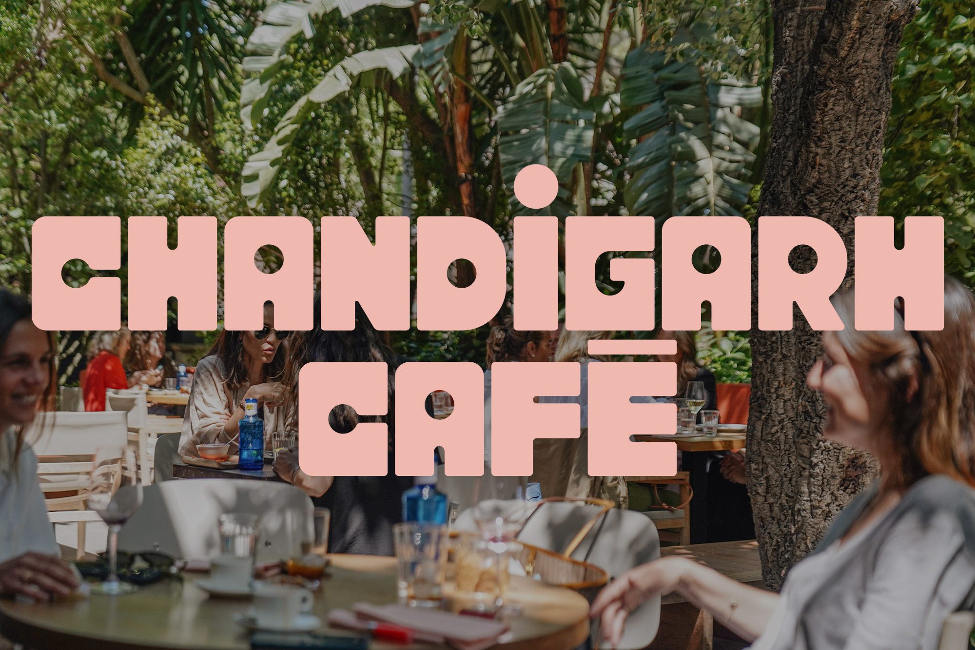
Chandigarh CaféInspired by Le Corbusier's mid-century modernism
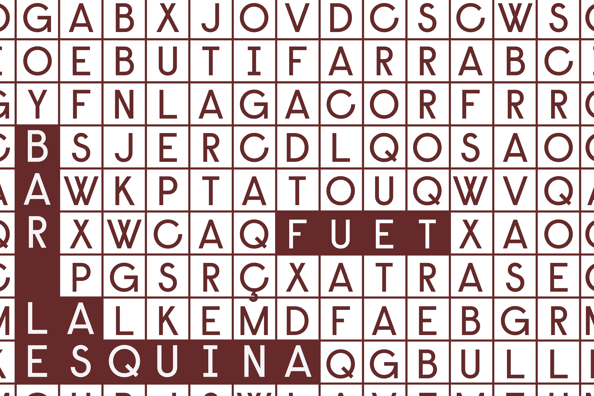
Bar La EsquinaA bar to while away the hours, inspired by crosswords
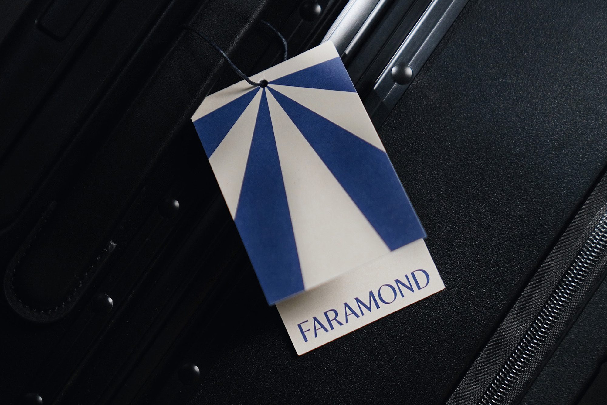
FaramondA premium travel accessory brand, for the journey.
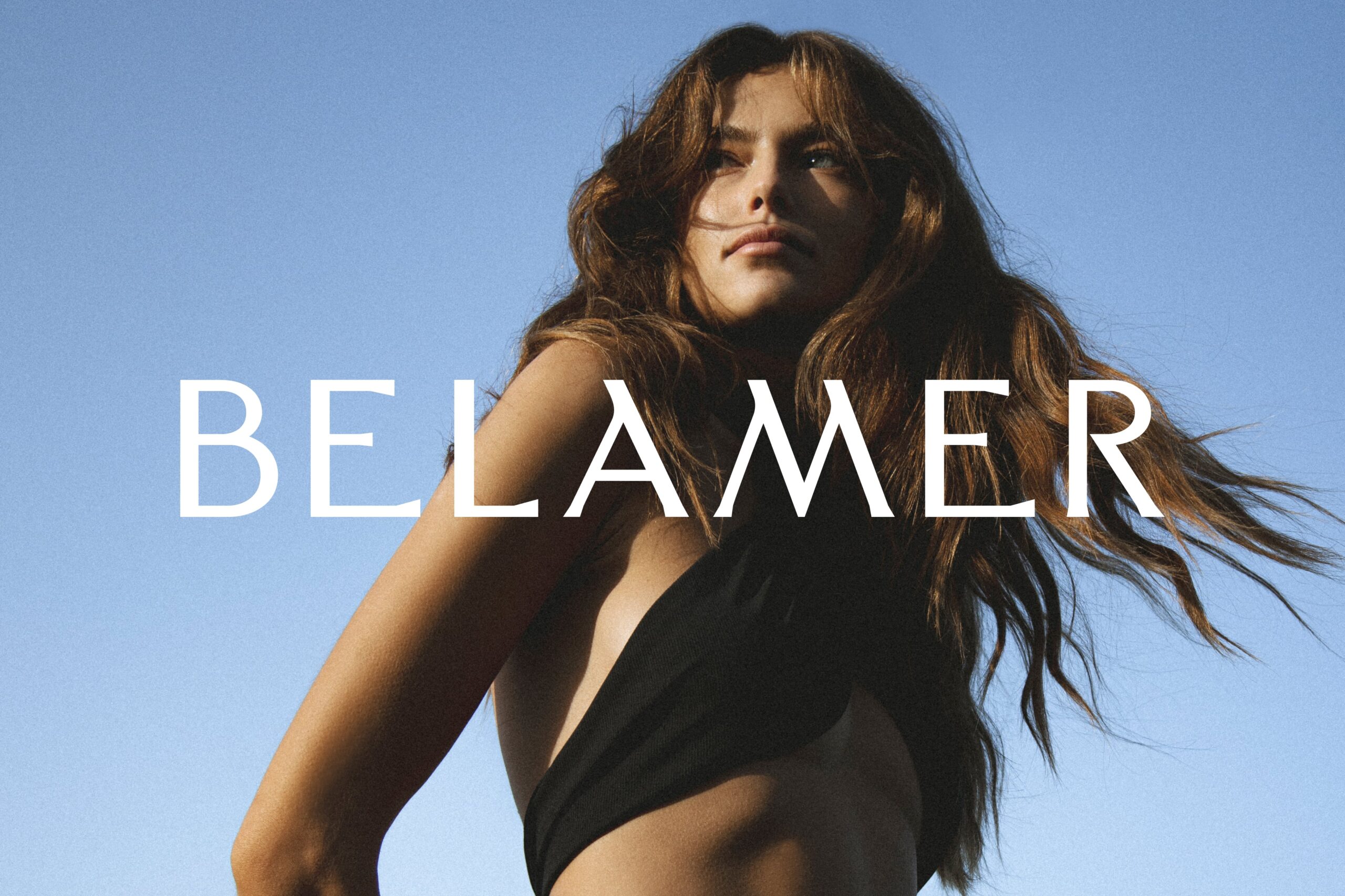
BELAMERSustainable beachwear, inspired by nature
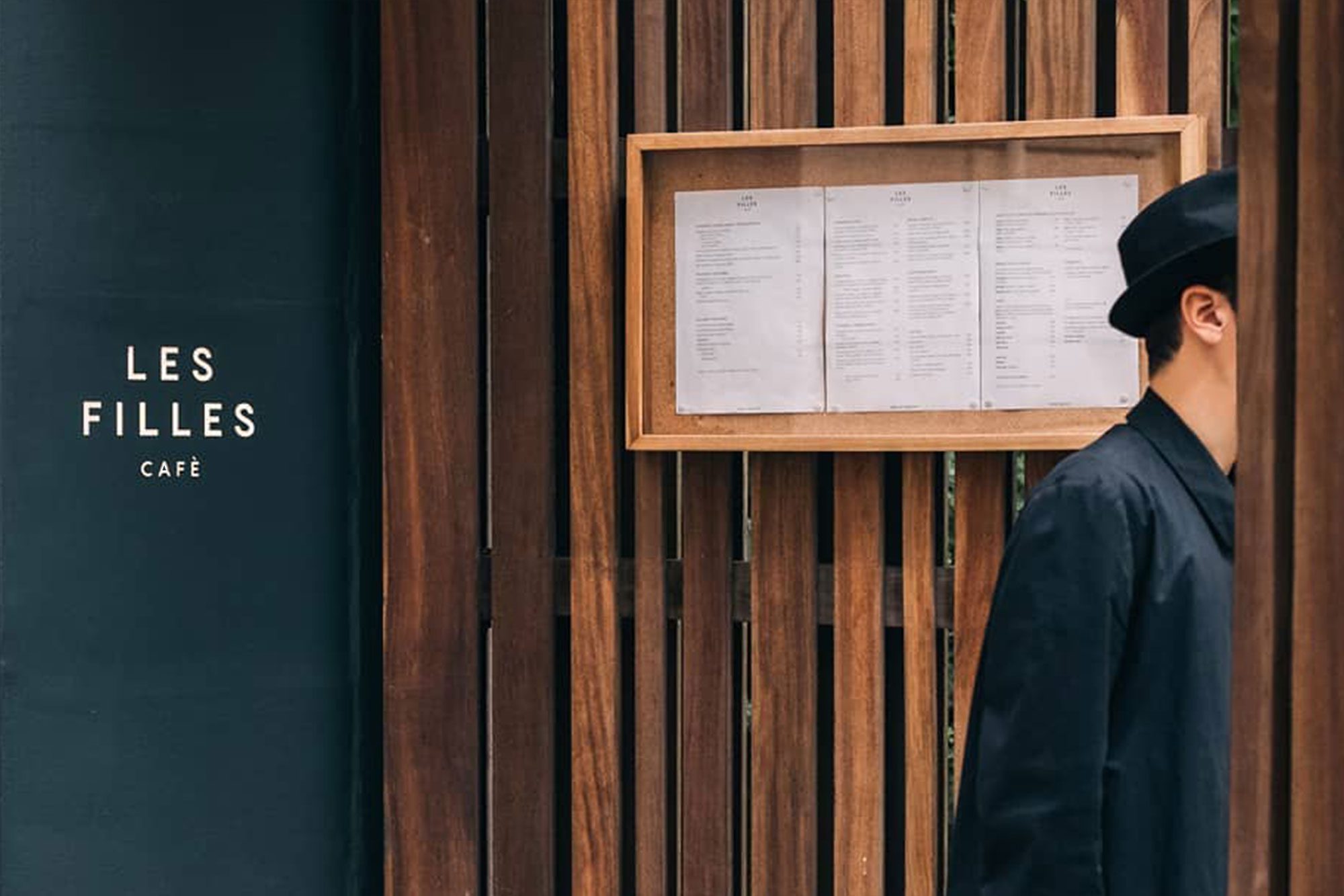
Les Filles CafèA well-being café in the heart of Barcelona
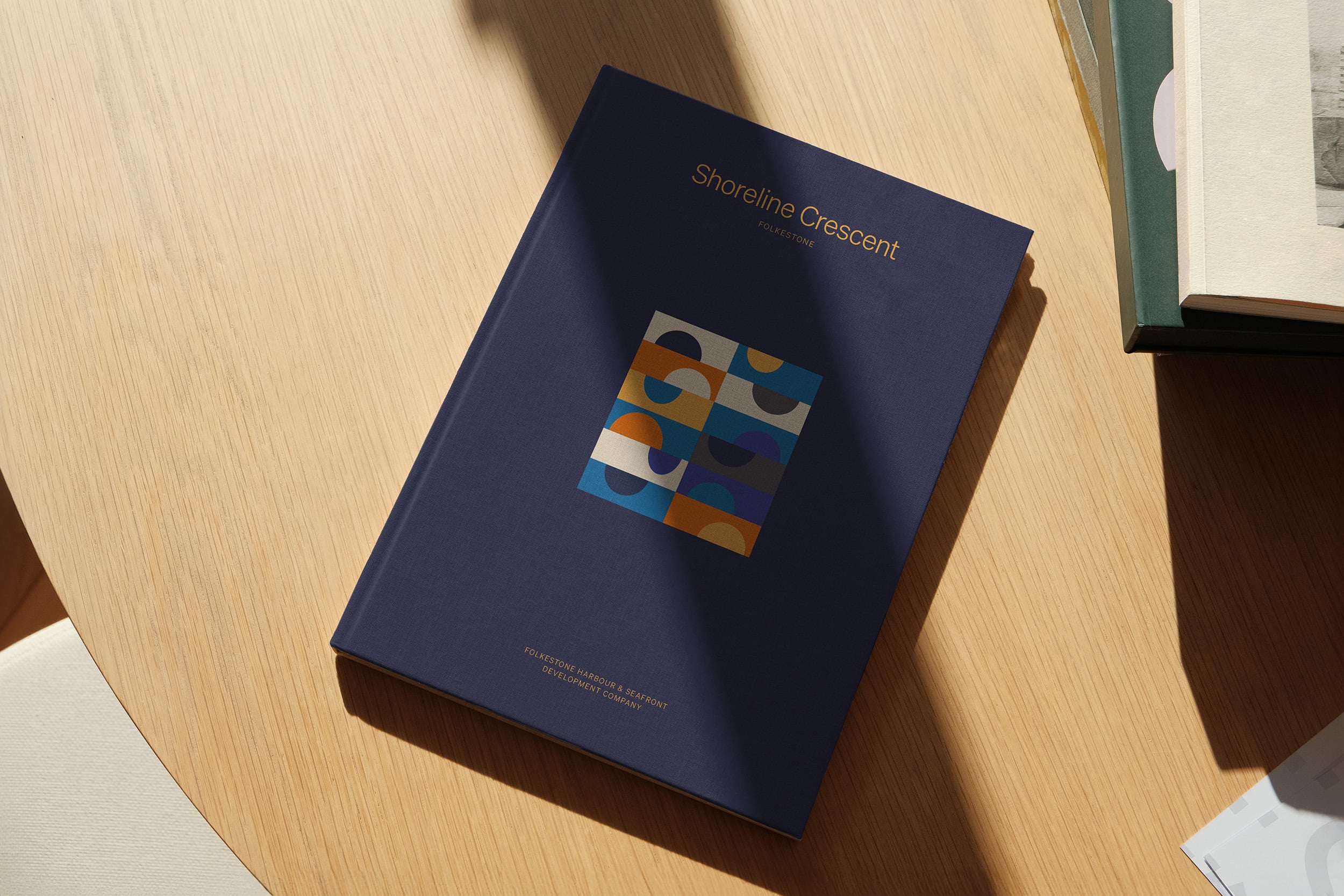
Shoreline CrescentA vibrant new community on the seafront of Folkestone
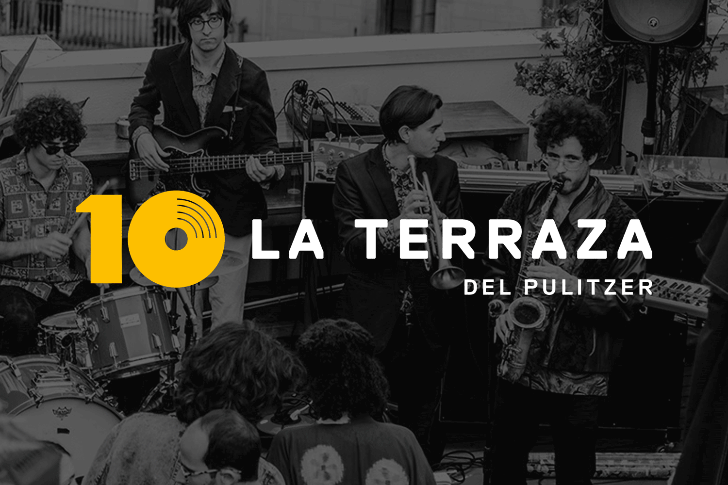
La Terraza del PulitzerCelebrating 10 years of a musical rooftop terrace
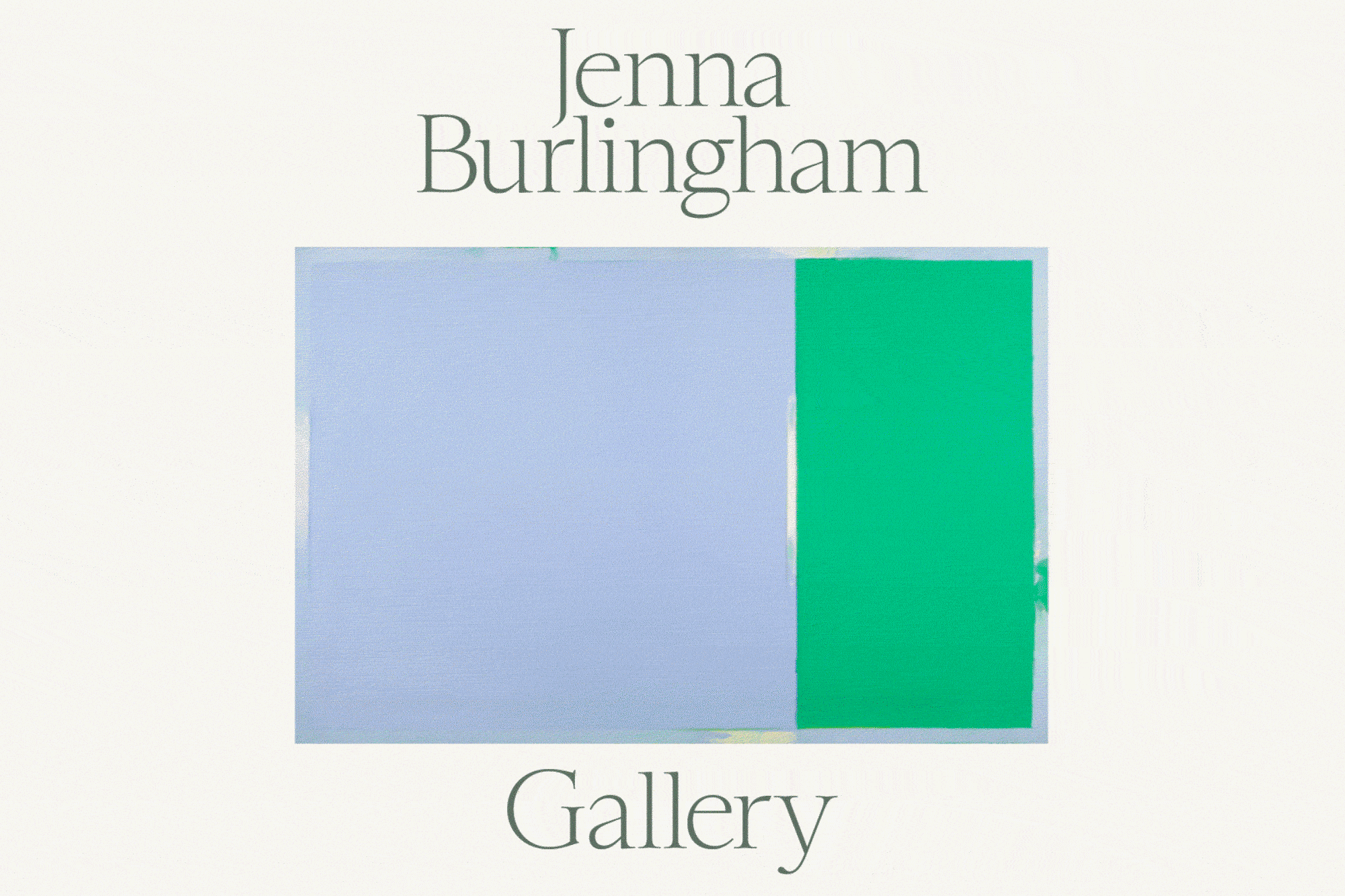
Jenna BurlinghamA gallery whose uniqueness lies in their ability to curate
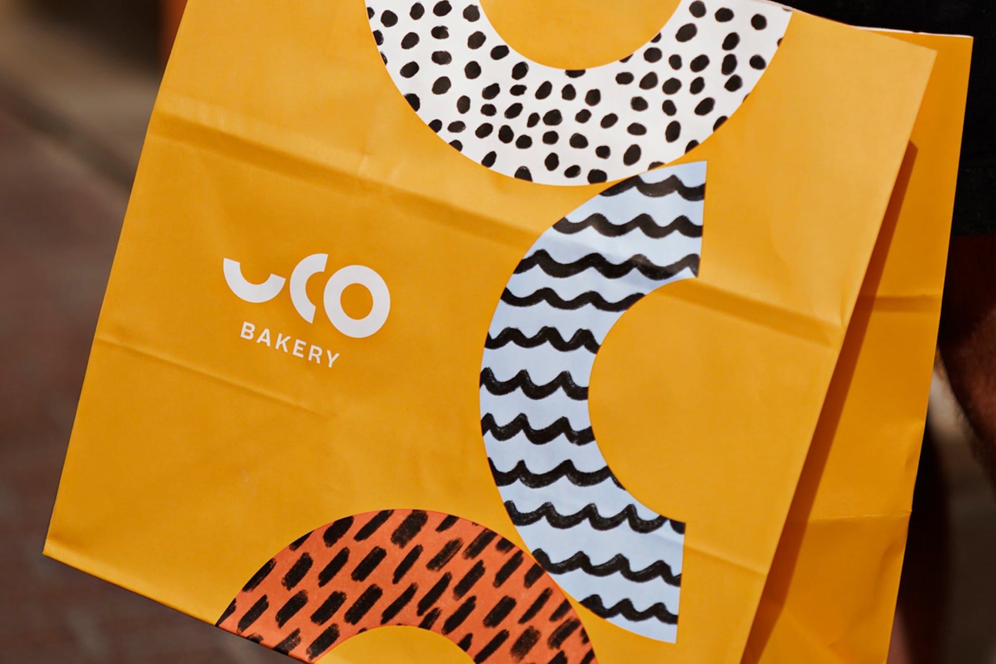
UCO BakerySourdough bread, and nothing more
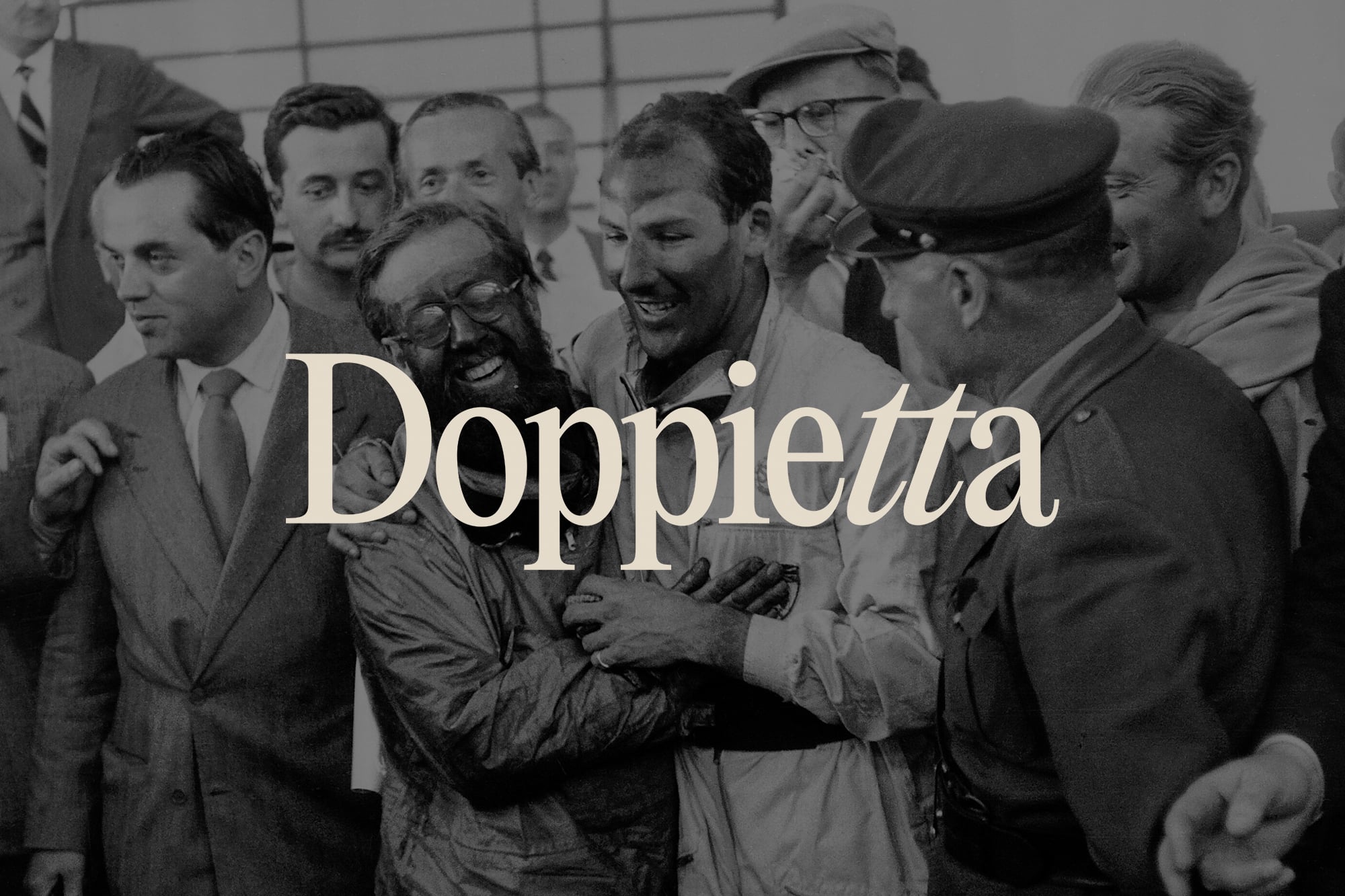
DoppiettaAn Italian restaurant inspired by the Mille Miglia
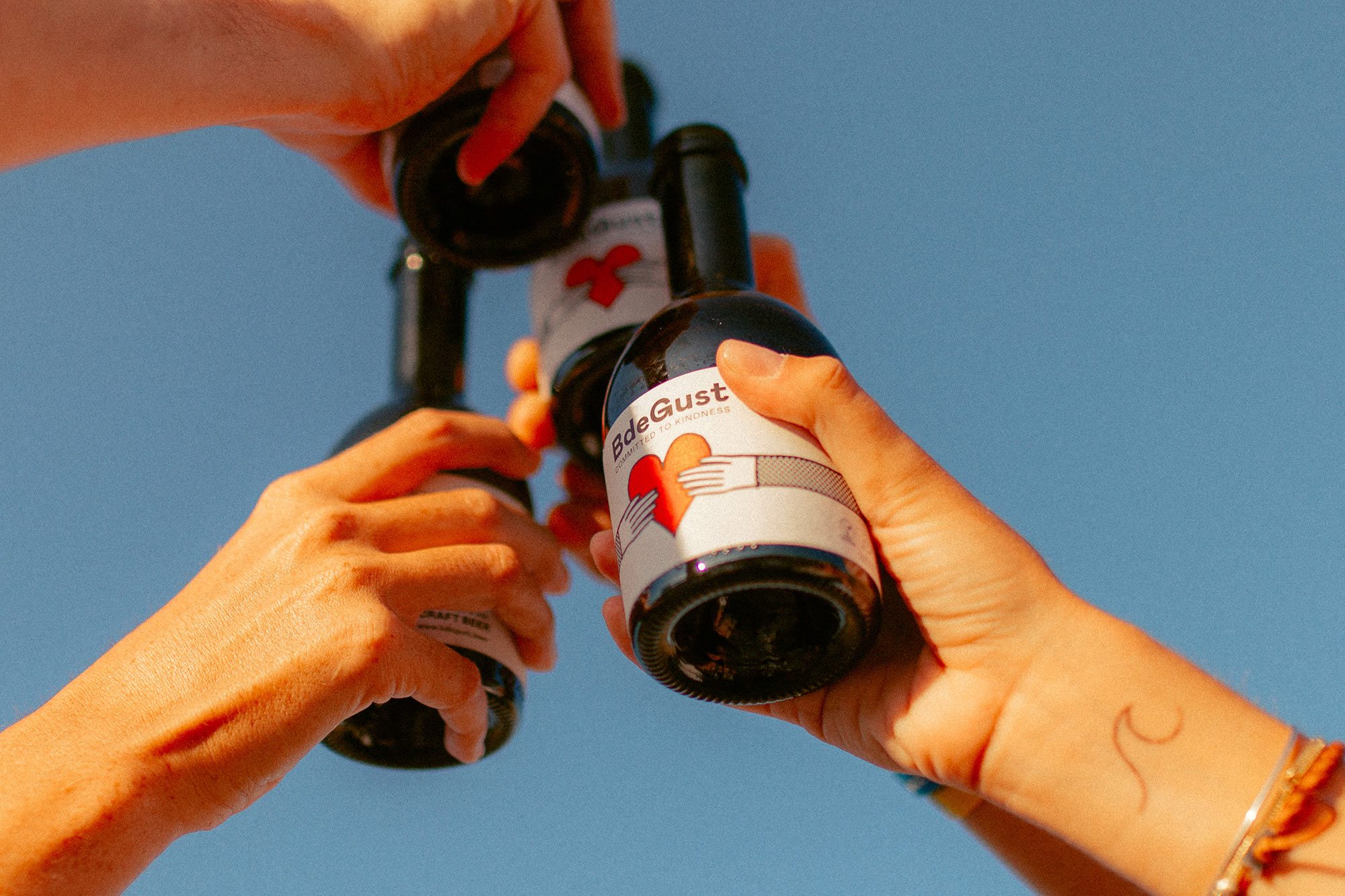
BdeGustA beer that’s committed to kindness
GMI StudiosPutting possibilities in motion
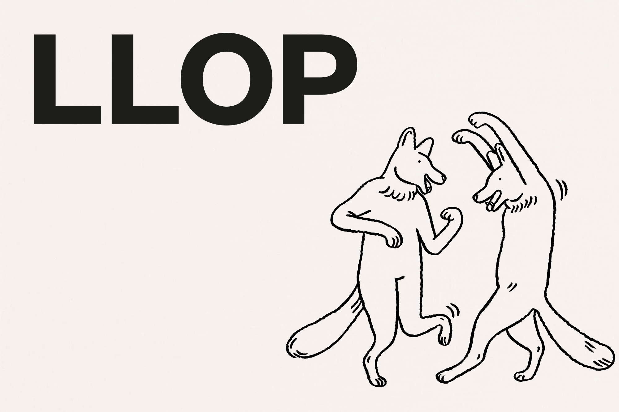
LLOPA fun loving all-day restaurant
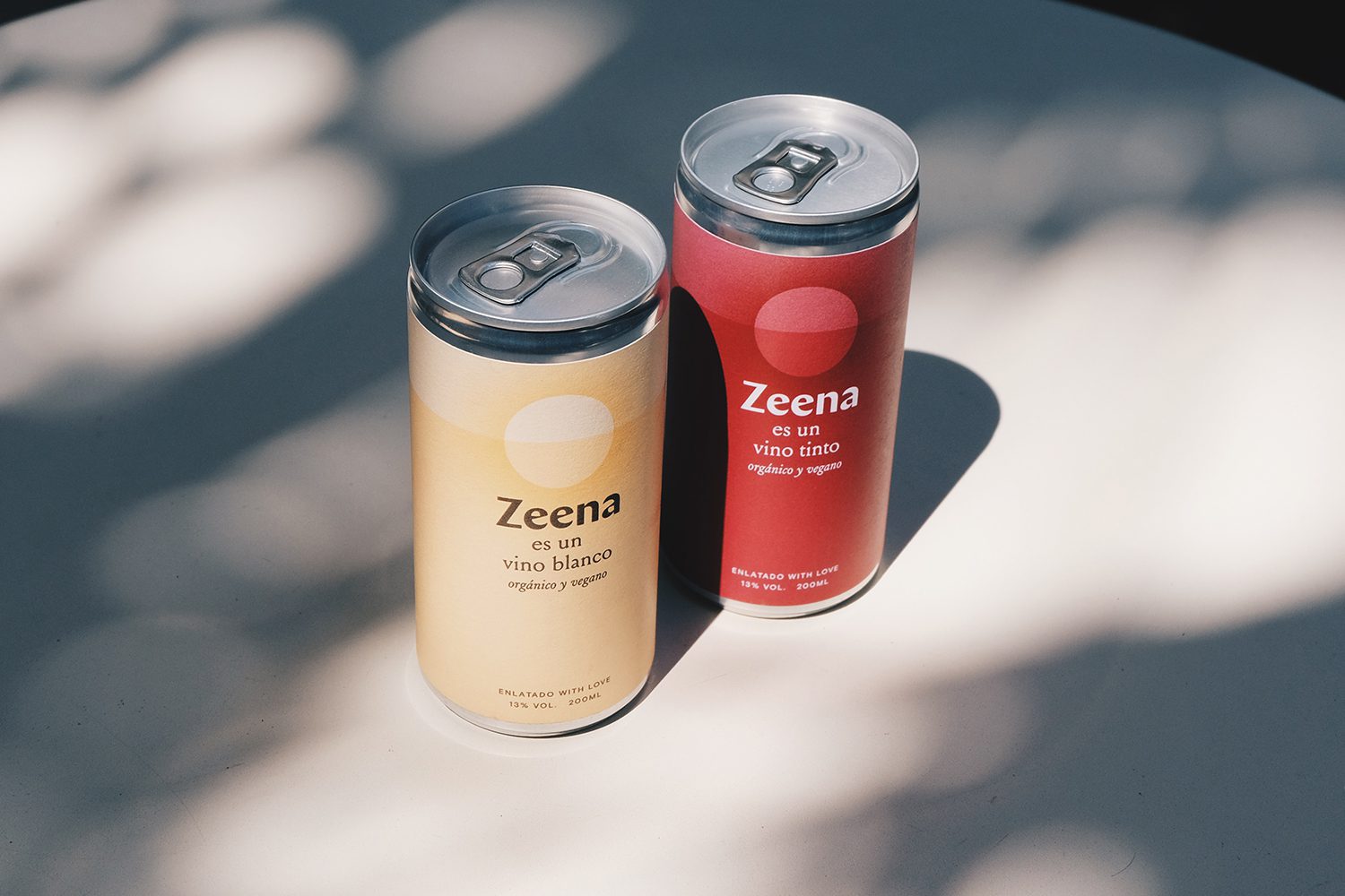
ZeenaA disruptive wine in a can
8 Holland StreetA London gallery and shop with an eye for detail
ROJOA Japanese Izakaya tavern lands in Barcelona
TragaluzA Barcelona culinary icon, under the skylight
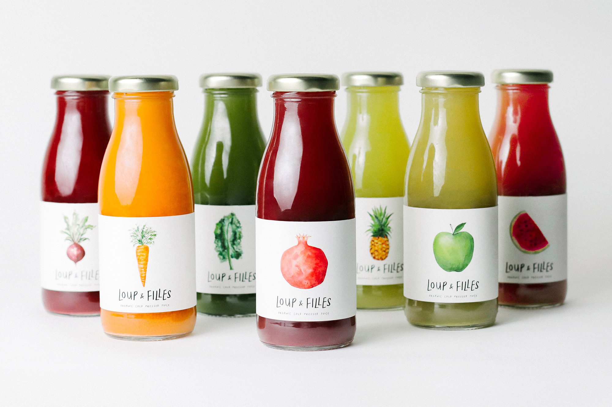
Loup & FillesA cold pressed juice, from leaf to lip